How Strategic Signage In London Can Boost Your Sales

Every sign you create is an opportunity for you to communicate with your customers. Strategic signs and consistent messaging will help communicate your brand’s story, boost recognition, trust and ultimately, sales.

Signs no retailer can ignore

Your signs should direct, inform and be located to give maximum impact. Outdoor signage should not only create interest but drive customers towards your store, while wayfinding signs make the customer experience a smooth and pleasant one.  Seamless journeys around your store can include maps and decals that drive customer traffic to specific areas. Signing for social distancing and a set direction makes it easier for customers to navigate your store and feel safe.

Persuasive signage should be located at the point of sale and should feature a very specific call to action that drives your customers’ purchasing decisions. Finally, inclusive signs extend a great customer experience to everyone who comes through the door.

The benefits of effective signage

From getting your customer through the door to guiding them smoothly around your layout, good signs are appealing and well located, with a clear message. A sign that is designed clearly can take the pressure off your retail team by answering customer queries at a glance.

Signs can be used to create a clear directional path through your store and can even point customers towards displays of items your keen to promote. This leaves your staff free to create a superb customer care experience that helps to differentiate your brand from the competition.

Optimise size for success

The size of your signage in London is critical to attracting customers. Differently sized signs achieve different purposes and need to adapt to different viewing angles. Try the 10 to 100 rule – 10 inches of letter height for every 100 feet of visibility.

Be careful, however, not to compromise readability. Scale graphics and frames to maintain balance and legibility and give your customers a call to action.

Signs that are designed to drive sales for a specific product have a tough job. Unlike signs that alert customers to discounts and clearances, you’ll need to create a very clear idea of the product’s benefits.

Don’t confuse benefits with features, however. Your soft drinks may be low in calories, but thirsty customers would rather know that they’re refreshing and thirst-quenching. Let customers know that your product solves their problem or makes life easier in some way. Show them how and why they need to purchase your product right now to enjoy its many benefits.

The 15-word rule

Want to create maximum impact? Then keep your message simple and observe the 15-word rule. Even with a more complicated promotion, a 15-word teaser will create a call to action that drives your customers towards the product you’re selling.

Match messaging with graphics for a sign that is simple yet unique and eye-catching. Humour and colour are two effective ways to make your signs stand out from the visual noise that bombards your customers every day.

Ask the experts

At The Sussex Sign Company, we can help you create eye-catching signage for your London store that will drive customers into your shop and boost your sales. Well-crafted signage is your secret weapon when it comes to succeeding in retail, so contact us today for more details.

Signage Your London Retail Premises Can’t Afford To Ignore

How long did it take you to get the design for your ecommerce site right? And the signage for your bricks and mortar premises in London? The fact is physical signs should never be an afterthought – they’re an important part of your sales team.

Signs can help your customers navigate your store, attract them to promotions and give valuable information. You pay close attention to the way your website looks. keeping it consistent with your branding. Paying the same attention to your signs will really pay off.

Getting your signage right first time

Before you start designing your signs, take a tip from the advertising business and narrowcast your message. By defining your ideal customer, you can target the right graphics and messages to make your signs effective and eye-catching.

– Keep it simple: the most effective signs have a clear and simple message. Too much information can be confusing and your signs will be ignored. If you can’t convey your essential message in 5 seconds, then shorten it or consider using more than one sign.

– Write a headline: use an effective message hierarchy of attention-grabbing headline, concise explanatory text, and a punchy call to action.

– Always add a call to action: every sign needs a simple, effective call to action that gets the customer to do something like call or visit your website.

The four signs you can’t ignore

Exterior signs

Whether you have a simple A frame outside your coffee shop or illuminated channel letters over the door, this is arguably your most important sign because it’s the one that captures your customers’ attention and gets them through the door.

These signs need to be branded effectively to convey an idea of the experience the customer can expect when they walk through the door. And they should make them want to cross the street to experience it.

Information signs

Wayfinding signs help your customers navigate easily around your premises and find what they’re looking for. Never underestimate convenience when it comes to attracting and retaining customers.

Once you start positioning your signs, you’ll become aware of any organisational snags that your customers will find frustrating, and can put them right. Keep these signs bold and colourful, but consistent with your branding.

Communicative signs

These will let your customer know about sales and promotions or they can showcase a new product. Done well, they can increase brand awareness, drive sales and even add a higher perceived value to a product.

Inclusive signs

When you’re appealing to customers, you need to be inclusive. That means complying with accessibility legislation not just in car parks and toilets but in the way you use your signs.

Signs should be both legible and readable and use pictograms and/or Braille where appropriate. Use san serif fonts and high contrast colours for the most effective signs and make sure they’re mounted at the correct height.

Effective signs for your store

If your retail premises need a new suite of exterior and interior signs, we can help. At The Sussex Sign Company, we have the experience and expertise to design, create and install signs that raise brand awareness and attract attention. Contact us today for signs that maximise your return on investment.

Signage History – The Ghost Signs Of London

Have you ever half glimpsed a faded piece of signage in London? Then you’ve seen a ghost sign, one of the fascinating pieces of advertising history that can still be seen around the capital. These fading adverts, like the Hovis sign in Haringey and the Bovril sign in Brixton, have endured over the centuries and survived against all odds.

Victims of modern sign making materials and techniques, these remnants of our advertising past can be found all over the world.

How were ghost signs produced?

The signs that remain are all a testament to the skill and craftsmanship of early signwriters. Smaller signs were often produced freehand, using the height of the bricks as a guide. Larger and more elaborate signs were often produced by a technique like stencilling – the design would be traced on paper with a spiked wheel and then chalk or charcoal would be used to mark out the perforations and create the outline of the design.

Particularly skilled signwriters would often embellish their signs with decorative flourishes like illustrations.

The early days of marketing

Ghost signs are a fascinating snapshot of changing attitudes in society – like the cigarette advert that claims smoking is good for your throat! Some of the businesses associated with ghost signs didn’t outlive their own advertising, but those that did moved with the times and started to explore other ways of bringing their branding to the public’s attention.

Though the heyday of signwriting was the late 19th and early 20th centuries, the art hasn’t died out. The craftsmanship that created the ghost signs is still around, although the materials have moved on – after all, many of the signs that remain were painted using lead based paints, making signwriting something of a risky business.

What modern signage can learn from ghost signs

With the uptick in interest in these remnants from marketing’s history, modern signs can learn from their more primitive ancestors:

– Good signs have a clear message: That’s demonstrated by the enduring popularity of ghost signs that keep the branding message simple. Your signs should be equally clear and easy to grasp, so your customers understand your business at a glance.

– Good signs withstand the elements: just like the lead based paint of old, modern materials should be chosen to withstand all weather conditions including harsh sun, wind and rain.

– Good signs boost business: there’s no way of quantifying what impact the ghost signs had in their time, but our enduring fascination with them suggests they continue to engage with passersby. A good sign will attract customers and have an impact on sales, otherwise you’ll need to rethink the way you’re using your branding and brand colours.

– Good signs reflect your business personality: Ghost signs are a snapshot of businesses that were around over a hundred years ago. If you want your signs to endure, they need to reflect the personality of your business by maintaining consistency across all the signs you use.

High quality signs for your business

Your current signage may not last as long as the beloved ghost signs, but at The Sussex Sign Company, we can help ensure they have just as big an impact. To find out how to maximise your ROI, contact us today.

Signage: 3 Trends Your Food Business Needs To Know About

If you own a food business in London, you’ll constantly be on the lookout for savvy marketing to give you the edge. Sometimes it pays to go back to basics and take a look at the way your signage is performing when it comes to advertising your cafe, pop up or food truck.

Your signs are still the best way to differentiate your business. But to make you stand out from the crowd, you need to make some intelligent decisions about the signs you use to get customers to queue around the block for your food. These are just some of the biggest food sign trends that you’ll want to make the most of.

Branding your signage

It’s time to toss out any generic signs and get branding savvy. The creation of a suite of signs that reflects your brand colours, logo and messaging communicates to internal and external customers and delivers a professional edge for your business.

Work with a professional designer to incorporate your existing branding or to work on a new personality for your signs. Customers want to connect with you as part of their experience and well-designed signs have a part to play in that personalisation.

Connecting online and offline signs

The chances are your business has a high level of social engagement. You probably use Instagram to post images of delicious plates and Twitter and Facebook to keep customers up to speed with specials and discounts.

You need to connect the dots between online and offline and make sure your social contacts are included in your signs, so your customers know where to find you online. Street signage is ideal for the task – include a witty or motivational phrase on your A-frame board and encourage your customers to share on your social networks to reinforce the message.

Explore vinyl wraps

If your business is based out of a food truck, then a vinyl wrap is a marketing opportunity you can’t afford to miss. Wrap your truck with images of tasty food or even your menu and you’ll stand out from the crowd.

But vinyl isn’t just for vehicles. This type of non-disruptive advertising is also perfectly at home in your bricks and mortar cafe. Add mouthwatering images, a thought-provoking message or some well thought out branding and your digital wallpaper will become an instant Insta trend.

Vinyl wraps or digital wallpaper are also ideal for time-limited campaigns or to make the most of your interior space. Eye-catching and engaging, this type of marketing is the smart way to make the most of every inch of your real estate, static or mobile.

Help your London food business stand out Now more than ever, it pays to have a serious sign strategy. Rather than sticking up a generic sign and forgetting about it, taking the time to understand how your business comes across to your customers and creating flexible signs that attract across a range of marketing channels will mark you out from the competition.

At The Sussex Sign Company, we specialise in maximising your return on investment, so contact us today to find out about flexible signs for your business.

5 Elements Of Effective Signage Design

Signage design is important so when you’re investing in new signs for your London business, you need to know that they’ll stand out from the crowd. From illuminated signs to wayfinding signage, how do you create eye-catching signs that really work? What are the elements that create successful signs that deliver a good return on investment?

Creating an effective and show-stopping sign is about more than carefully considering specific elements like fonts and colours. It’s about more than a sign simply looking good or being in the right place. Good signs are part of the story that your business tells about itself.

Aesthetics that create a connection

The way you convey your message can create an emotional connection with customers. A dull and plain sign can contain the same information as an aesthetically pleasing one, but a beautiful sign will always create more of a direct response in your customers. Be careful about the interplay of design elements and create something that is pleasing to the eye for maximum impact.

Supplying the right information

Signage design and information go hand in hand, with the essential information delivering the functionality to support the aesthetics. Ask yourself whether your sign includes the details you’d expect to see as a customer – is every piece of information essential, or can you reduce the amount of text yet communicate your message just as effectively, or more so?

Remember signage legibility and readability Beautiful graphics and punchy, well-chosen information will only take you so far. Now that you’ve captured your customer’s attention, they must be able to read your sign and absorb the information at a glance. However, it’s at this stage in the design process that things can go awry, particularly if you get the scale wrong. Charming graphic elements can assume monstrous proportions and elements can look out of whack with each other.

You should also be designing for accessibility. Design for your visually impaired clients and everyone will benefit from the clear and legible signs you create.

Boost your brand

However accessible your design, with perfectly balanced graphic elements and a strong, punchy message, you can still come unstuck. One of the benefits of creating successful signs is to boost brand recognition and identification. However, if your sign doesn’t connect with your brand, then it won’t connect with your customer to deliver that brand boost.

It’s not difficult to connect your brand with your signage – you can create consistency with the use of logos, straplines, brand colours and typography. If you’re not happy with those elements, then a new suite of signs could be the opportunity for a rebranding exercise.

Create a customer experience

Your signage design is all part of creating a welcoming environment that delivers a customer experience that’s superior to the other guys. By creating signs that are a seamless extension of your overall brand identity, you’re delivering another piece of the experience that customers will want to tweet and share.

Delivering effective signs

At The Sussex Sign Company, we’ll work with you to create effective signs that maximise your return on investment. Whether you’re in London or the South East, contact us and our end to end service will deliver signs that get Instagrammed and help you to create an experience that’s beneficial for your clients and your brand.

5 Ways To Update Your Current Signage

Update your signage! Is your fascia looking a little tatty or does your signage no longer reflect where you are as a business? There can be several different reasons for needing to update your signage – so here are 5 ways to help you keep your signs looking fresh, to stay ahead of the competition.

Try rebranding

Even the biggest corporations undergo regular rebranding, no matter how subtle. How you handle a rebrand can turn it into a useful marketing opportunity and allow you to create a cohesive look for your commercial premises that might even extend to your vehicle fleet.

Whether you keep it as subtle as an overhaul of your colours and fonts or go for a full-scale change of logo, a well-executed rebranding exercise can generate sales, increasing revenue to pay for the change of look.

Update materials

The chances are that, since your signs were installed, the materials used have advanced significantly. Investing in premium quality signs is your ultimate marketing tool. If your signs can withstand extreme weather conditions and come up shining, then they’re worth the investment.

Coupled with a planned maintenance programme to keep your exterior signs in good condition, you’ll boost brand awareness and business reputation. When your signs look good, your premises are more attractive to your customers.

Expand your signage

Instead of replacing your existing signs, you can update your signage and rejuvenate the look and feel of your premises by adding extra signs that benefit your customer. Additional wayfinding signs can direct customers to promos and retail opportunities that enhance the customer experience while boosting your revenues.

You could also consider adding point of sale signs and displays that direct customers to a time limited promotion or a new product you’re keen to bring to their attention. The sales you generate with additional signs can offset the costs of your investment.

Add illumination

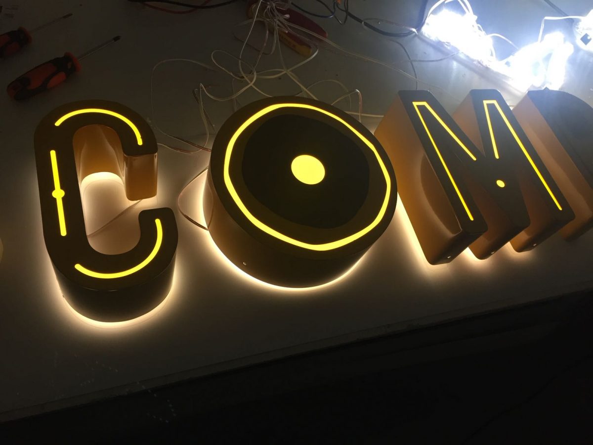
An illuminated sign means that you can truly maximise your marketing appeal, 24/7. Energy efficient LEDs have made sign illumination a feasible choice for any business and there’s no doubt that well-constructed halo letters with a strong illumination effect will set you apart from the competition and give your signs an instant update.

A cost-effective trough light is a quick and easy way to add a different dynamic to an existing sign. From halo lighting to the use of large scale monument signs packed with LEDs, ask your sign designer for their expert advice and add the power of illumination for a quick facelift.

Rethink design

If you want to create a whole new signage suite, then you’ll want to rethink everything from the ground up. Working with a professional designer is the savvy way to focus your ideas and maximise your return on investment. After all, a set of new signs may not come cheap, but as your biggest marketing asset, they offer surprisingly good value for money.

Whether your business needs an overhaul or your nearest competitor in West Sussex has signage that’s putting yours to shame, we can help. At The Sussex Sign Company, we make it our business to help you maximise your ROI with bespoke signs that help you utilise this piece of prime marketing real estate to its fullest potential, so contact us today.

Interior Signage Is Something No Retailer Can Ignore

Want to attract customers and drive sales to your London retail premises? High quality interior signage can do that and so much more. Think of it as an extension of your website, with clear navigation and eye-catching design that help your customers to navigate your bricks and mortar premises and make the most of any offers and promotions.

Narrowcast to target your audience

Narrowcasting is all about putting the right sign in the right place. That means being specific about location or a product, and keeping the message itself simple. With interior signage you can aim to convey the main themes of your sign in 5 seconds or less. If you miss the mark, narrow the focus down to just one key message or use a series of signs to get the full message across.

Hit the headlines

When you’re pinpointing the messages you want to narrowcast, try writing in headlines. In other words, be as punchy and concise as possible and then see whether you can take out any unnecessary language.

Observe the strict hierarchy of interior signs by following the following structure: headline, explanatory text, call to action. An effective sign will have the goal of getting the customer to do something, so make sure you create a killer call to action.

Finding your way

Also known as directional or informational signs, wayfinding signage is designed to help your customer navigate your premises. Make it is easy for them to find what they’re looking for and they’ll appreciate the convenience and return another time.

These types of signs need to be bold, concise and eye-catching, so think about the fonts and colours you need to use for customers to understand the message of the sign at a glance.

Using directional signs has another benefit when you’re laying out your store. You’ll quickly establish what signs need to go where and whether your layout is easy to navigate. It all helps to create a satisfying customer experience.

Persuade with signage

Do you want to draw your customers’ attention to a particular product or promotion? Do you want to influence consumer behaviour or highlight an unloved product?

Effective persuasive signs can create a hidden gem or raise the perceived value of an item. They can increase the awareness of certain brands and drive retail sales, so make them eye-catching and witty.

Be inclusive

Creating a customer experience applies to all customers equally, which means paying attention to the inclusivity of your signs. For example, you may need to use certain high contrast colours or legible fonts and provide Braille or tactile alternatives to certain signs.

Ensure that signs are installed at the correct height for your disabled customers – if you have accessible facilities and you’re not promoting them, then you’re marginalising your customers.

Optimise interior signage

At The Sussex Sign Company, we can help you create a suite of interior retail signs, including decals and digital wallpaper, that can boost brand awareness, give your premises pizazz and delight all your customers, while maximising your return on investment. Contact us via phone or email to get the ball rolling.

Contact The Sussex Sign Company today to see how we can help you.

Digital Wallpaper Signage and The Benefits For Your Business

Digital wallpaper is used when  you need to move beyond internal wall graphics to make a splash, you need digital wallpaper. This form of signage can bring texture and colour to a space, as well as cementing your brand personality. This type of large format printing is ideal when you want to create a showstopping display, perhaps by creating a fotowall of your brand achievements for a particularly eye-catching look.

1. More scope for creativity

Whether you want to cover your walls with product images or create a calming atmosphere to welcome your clients, digital wallpaper gets the job done with ease. Whatever style you choose, you can create a unique aesthetic for your premises, directing your clients’ attention towards your products and your brand in a creative way. That level of personalisation can help to differentiate your business from the competition by creating a unique identity.

2. Always look on-trend

Because digital wallpaper can be printed on-demand, you can always be at the bleeding edge of new marketing trends. That’s because digital wallpaper manufacturers don’t sit on their stock and they can be more responsive to changes in marketing. If you’re a business that relies on your visual branding being top notch and totally responsive to the latest marketing trends, your digital wallpaper can change with every marketing campaign. That way, your fashion or beauty business can always look on-trend.

3. Instantly memorable signage

Imagine walking into your hotel reception or a fashion boutique and discovering a stunning high definition fotowall that instantly sets the tone for the premises. By creating images unique to your business, you can set the tone as soon as your customers arrive. That kind of attention to detail can also be instantly memorable.

4. Boost your brand

Have you ever seen something so amazing that you had to photograph it and post an image on social media? If you want your premises to take advantage of the fastest growing social media platform and be Instagram worthy, then this kind of decoration creates that instant wow factor and boosts the profile of your brand. The interesting thing about your personalised digital wallpaper design is that it’s your brand that attracts the attention as much as your wallpaper.

5. It lasts longer

Digital wallpaper is the signage that lasts. You don’t get the chips, dirt and marks associated with traditional forms of decorating and you won’t need to redecorate in a couple of years because that expensive wallpaper or paint is looking a little dull. Instead of paying the hidden costs of constant redecorating, investing in digital wallpaper means you’re investing in durability and a long lifespan. Digital wallpapers are fully resistant to wear and tear and look fresher for longer – which saves you money in the long run. Digital wallpaper can get you inspired to take your business signs to the next level, with semi-permanent displays including high definition fotowalls. Want to know more about the ways that digital wallpaper can boost your London business? Get in touch with The Sussex Sign Company today for more details, and we’ll help you maximise your return on investment with internal signage. Call The Sussex Sign Company today on 01273 424900 or email us here

Business signage and the benefits of LEDs

There are many benefits to changing to LED signage. Did you know that the per-lumen price of LED bulbs has fallen by a factor of fifty since they first came into use in the 1960s? In fact, LEDs are now so cheap that there’s really no excuse not to use them for your illuminated signs. Still need convincing? Here are the biggest benefits of LEDs for your business.

Exceptional Efficiency

A highly efficient technology, LED bulbs convert around 80% of the electricity they use into light. And because that light is generated in one specific direction, wastage is reduced, driving down your energy bills.

Extended Lifespan

LEDs don’t burn out – they simply fade away. And their lifespan is astonishing – an LED with a life expectation of 100,000 hours could stay continually lit for 11 years. Use that bulb for just eight hours a day and it could last as long as 20 years without replacement.

Eye-Catching Signage

LED light is instantly on at 100% and produces a clear, brilliant light in a huge range of colour options. Visible in sunlight, and pin-sharp at night, LED light creates the clearest illumination possible for your logo or outdoor signs.

There are none of the brightness issues associated with neon and far lower running costs. Thanks to their efficiency and durability, you can create beautiful effects that last far longer than other conventional lighting methods.

The Sustainable Choice

Whether your business has sustainability targets or not, lowering your environmental impact as a business is something your customers respond to. A typical 10W LED bulb uses around 80% less energy than a neon sign and can be fully recycled because there are no toxic materials involved in its design.

The benefits of LEDs include reducing the carbon footprint of your business by up to a third and support technology that preserves resources, one of the great benefits of LED illuminated signage is a savvy choice.

Easy to Maintain

Simple and durable, LEDs can be used just about anywhere. There are no glass tubes to break, and they’re simple to keep clean because they emit very little infrared or UV heat and therefore aren’t a burn hazard.

They’re a breeze to maintain, giving you long-lasting light with a fraction of the costs of other lighting systems.

Flexible Options

Smaller, thinner, brighter and completely controllable, LEDs are the ideal choice when you need to create signs that takes your marketing to another level. For example, LEDs will dim right down to 10% brightness smoothly and seamlessly.

The sheer range of options for colour and control make LEDs the obvious choice for professional-looking signage that effortlessly stands out from the crowd.

Ask the Professionals

If you want to harness the power, flexibility and benefits of LED lighting for your illuminated signs, then talk to us. At the Sussex Sign Company we offer end-to-end services to design, create, install and maintain your signage in London to the very highest standard, ensuring a maximum return on your investment. Call or email us for more info.

Five Best Practices When Creating Retail Signage

Your in-store signage is the first point of contact between your retail business and your customers, and critical to creating a valuable customer experience. In fact, 88% of independent store owners surveyed by A.R.E. | POPAI intend to increase their budget for signs and graphics over their previous year’s spend.

Retail signs are a highly effective way of converting customers and influencing and driving sales. However, it’s important that you fall in line with existing best practice for the best effect, because if you’re not displaying your message effectively or in the best possible way, then your investment will be wasted.

Invest in quality

Start by investing in the best quality materials you can afford. This projects a serious and professional image of your business and inspires confidence. When your wayfinding signs are high quality and your halo lit fascia sign is eye-catching and high impact, you’ll differentiate yourself from the competition in the most effective way possible.

Narrowcast your message

Visitors to your store may be time poor and not in the mindset to be receptive to a large message. By narrowcasting – literally narrowing your message down to the essentials – you’ll keep the content of your retail signs crisp and current. Keep your signage location-specific or product relevant for the best effect.

Be consistent in your signboard usage

If you only use your signs to showcase promotional offers or point the way to the toilets, then you’re guilty of not using your retail signs as effectively as you could. When creating wayfinding signs, walk the store to create the most consistent path through each zone and then think about the ways you can incorporate retail signboards to drive sales and engage with your customers by using signs to convert interest in a product to a sale.

Think about signage placement

Window signs will need to be anti-glare, exterior signs need to be legible from a distance and promotional offer signs need to be placed in your customers’ eyeline. The placement you use for your signs is critical to their effectiveness, so think carefully about positioning, lighting and colour schemes for your retail signs.

Keep it simple

Try writing your signs as headlines with a clear hierarchy – headline text, message body, call to action. The fewer words you can use to put across your message, the more effective it will be, so use the 5-second rule to refine your signs. If it takes longer than 5 seconds to convey your message, then you need to go back to the drawing board. An effective sign has one simple goal – to encourage the customer to act in a way that benefits your business.

Ask the experts

Looking for effective signage in London? At The Sussex Sign Company, we’re experts in getting the best possible return for your investment. We can create a suite of signs and signboards that will promote your business and convert passersby into customers, so contact us via phone or email today for more details.