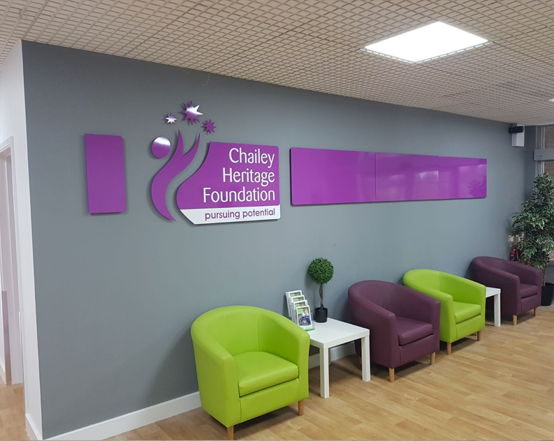
Signage For Real People, To Maximise Your Event

If you’re holding an event in West Sussex, are you overlooking the basics such as your event wayfinding signs? These signs can help your guests move smoothly from place to place, which is why you need to put yourself in their place. People can get lost or become overwhelmed by the sheer scale of an event. Or they might just want to know how to get to the bathroom. By using well thought through signage that stays consistent with the branding of your event, you can help to manage what is often an undervalued aspect of your event.

Branded event wayfinding signs create a less stressful event. That in turn helps to optimise the event experience and creates positive feedback. By taking a visual approach to the challenges of event organisation and flow control, you contribute to a more organised environment for your guests.

Walk in your guests’ footsteps

Successful navigation depends on siting signs where your attendees are likely to see them when they need them. Directional signs for amenities like the restaurant or bathroom should be situated throughout the event, not confined to within a 10 feet radius of those locations. Walk through the layout in your guests’ shoes, asking the questions they’re likely to ask. That will help you to fine tune the positioning of your signs.

Use your branding wisely

Your signs need to be bold, bright and easy to read at a glance, otherwise the experience can quickly become frustrating rather than enjoyable. If your brand colours are suitable for creating easily readable signs, then use them. However, if they make your signs illegible, stick to approved high contrast accessibility colours and limit your branding to your logo. When you’re designing wayfinding signs, best practice in readability and inclusivity should always be your guide.

Keep signage simple

While it’s tempting to want to create a brand personality with your signs, you need to remember their primary purpose, which is to inform and guide your attendees. By all means, add your logo and use your branding fonts, but never let them obscure the message. Keep wording to a minimum and use universally recognised pictograms wherever possible. Only use personalisation where it’s appropriate and where it won’t obscure the primary function of your signs.

Think through arrows

Arrows are a part of the visual language of wayfinding, but think carefully about the way you use them. Never rely on them as the sole means of navigation and make sure that when you do use them, there’s no ambiguity in what they’re indicating. In fact, you may be better to use multiple signs rather than rely on arrows that could be interpreted in several different ways.

Professional wayfinding signs for your West Sussex event

When you need to create the right impression and ensure that you event is managed properly, you need to work with a professional sign company. At The Sussex Sign Company, we’ll discuss your wayfinding signage needs and put together floor and wall signs, A-frames and banners that help to create the optimum attendee experience. You’ll work with our professional designers to create the perfect signs for your event and to solve the challenges of event organisation with a visual communication solution that really works. Contact us for more information and advice.

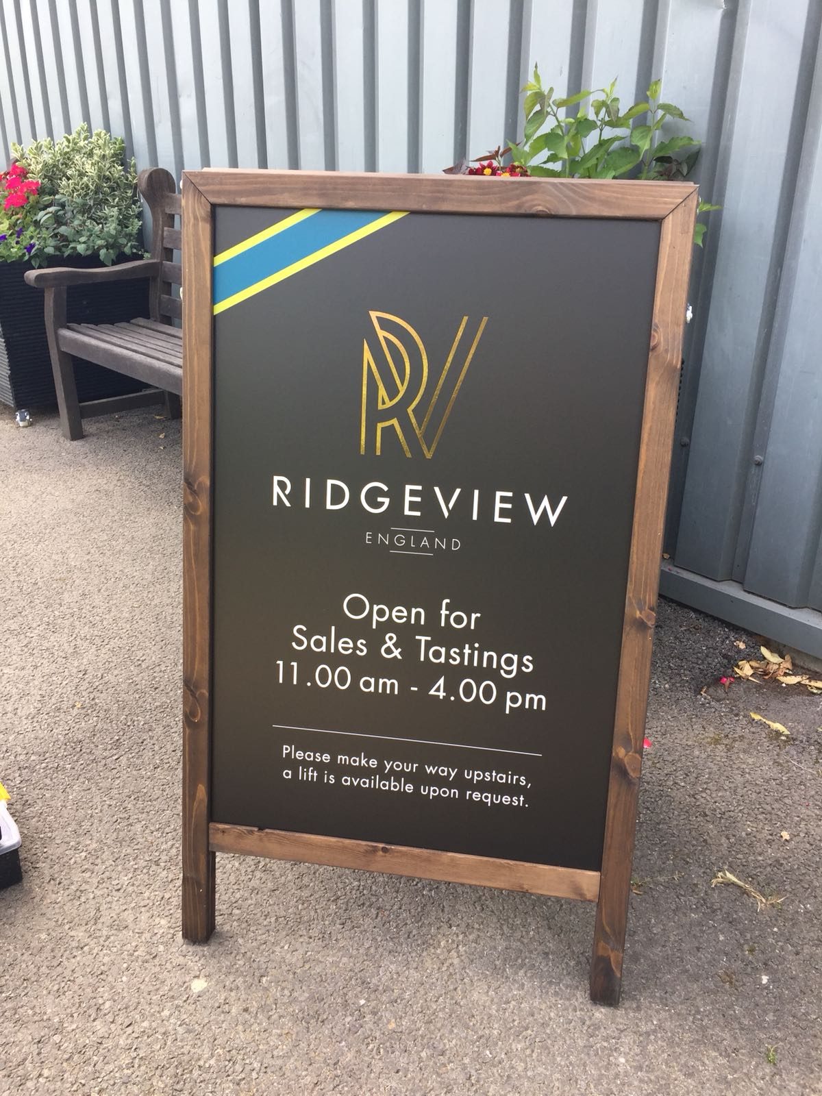
Internal Wall Signage Makes Good Business Sense

If you think that a coat of paint can equal a premium brand experience, then stop reading now. Internal wall signage are a savvy and cost-effective way to create a positive impact and they make excellent business sense when you’re creating a B2B or B2C purchasing experience.

Purchasing decisions are emotional

Imagine immersing your clients in an environment that’s creative and packed with brand-enhancing graphics. Immediately, you’ve put them in the right mood to consider your product and to associate it with the atmosphere you’ve created.

There’s no limit to where you can use internal wall signage either. Create a lobby area that engages your client from the outset with informative and stimulating graphics. Plaster the walls with images of your mouth-watering treats, your innovative graphic design ideas or your happy and productive staff and you’re already opening the conversation with your client in a way that delivers an experience they’ll enjoy and that will make them keep coming back for more.

Attract talent

If internal wall signage can engage and entertain your clients, imagine how they’ll impress potential employees? Creating a dynamic office or retail space is something that the likes of Google excel at, using digital wallpaper and internal graphics to showcase their creativity. It’s something that is filtering down, so that even young companies are harnessing the power of graphics to create the wow that their employees crave.

In a 2015 workplace review, 85% of respondents said that workplace design was important to their decision to stay with a company. Workplace design can be an influencer on job satisfaction, motivation and productivity, making it a must for talent retention.

A hassle free signage option

Yes, a coat of paint is relatively simple and straightforward. But even if you use a striking colour scheme and all the colour psychology theory you like, it still can’t match the power of the visual image. As humans, we retain information far more easily in graphic form, which makes internal graphics a smart way to transform your office or retail premises.

Vinyl wall graphics are a hassle-free option that transforms your space with the minimum of disruption. Painting leaves behind fumes and dust sheets can be a potential trip hazard, and a revamp of the physical workspace can be hugely disruptive and time consuming. However, adding beautifully-designed graphic signage can deliver stunning effects quickly and cost-effectively.

Achieve your objectives

If you want to build and enhance your brand, make employees happier and more productive, impact positively on the way that clients and customers approach your marketing and create the perfect decor for commercial or retail spaces, then wall graphics and signage can do it all.

At The Sussex Sign Company, we can wrap, print and otherwise transform your interiors with stunning wall graphics that make your shop or office a joy to visit and that create a user experience that positively motivates the purchasing decision. If you’re interested in enjoying the benefits of internal wall graphics and digital wallpaper for your business in West Sussex, contact us today and we’ll be happy to help.


Get The Most Out Of Directional Signage For Your East Sussex Event

Whether you’re organising a charity fun run or a festival, directional signs are a critical part of the audience experience. Here’s how to get the best out of directional signage.

Keep it simple

They say that less is more, and it’s the smart approach when creating wayfinding signs for your event. Keep the design clean and simple for the biggest impact.

Use colour for visible signage

If the message needs to be simple, you can add interest with colour and fonts. Black text on yellow is highly legible, but you can experiment with your corporate colours. Stick to san serif fonts to create modern and readable signs.

Put signs where your audience see them

Don’t restrict signs to certain places. Scatter them visibly throughout the event, so that people always know where the closest toilet or refreshments tent can be found. Make sure you walk the course or the event space before the event to ensure that signs are exactly where they’re needed.

Point the way

Finally, make sure that your signs are unambiguous – arrows shouldn’t be confusing and may need to be supported with other explanatory signs. If you need help to get the most out of your event signage, contact The Sussex Sign Company via phone or email today.

How to Choose the Best Signwriter for Your Business

Finding a great signwriter should be easy in this day and age. After all, we have the internet with its range of trade checking websites to help us make that decision. For example, if you were looking for signwriting in Crowborough, you’d Google it and take your pick. But how will you know you’ve really chosen the right signwriter to take your ideas and concepts from design to installation?

If you want to ensure that you’ve found the right signwriter for you, you need to be clear on why you need quality signage for your company and the type of signage that’s going to work for you. Having the killer idea is only one piece of the puzzle – your signs should be executed to your specifications, using the right corporate colours and logo, manufactured from durable and appropriate materials and installed in the right place.

What Quality Signage Means for Your Business

Signs are a brilliant marketing tool for any business. They’re your primary visual assets, and they’re a powerful tool for promoting brand recognition. A great sign will differentiate your business from the competition – over 76% of consumers say they’ve visited a business because of the quality of its signs – and provide advertising 24/7. And once you’ve paid the upfront costs, good signage is one of the most cost-effective forms of marketing there is, creating impressions all day every day.

Given what a great return on investment signage has, and how much it can boost your brand, finding a sign company that can meet your needs becomes even more imperative.

Individual Expertise or Integrated Services?

It’s very tempting to try to find the best designer and invest in some exceptional designs for your signage. After all, creating a visual wow factor is what will set your signs apart from the competition and attract customers to walk in off the street. Then you’ll need to find a company that can manufacture those signs and make good on your designer’s vision, and then you’ll need to find a handyman who can install them with good-quality fixings in the optimum position.

Or you could find a sign company with an excellent reputation that offers all these services as an integrated package. The advantage for you is that you’ll know exactly what’s going on at every step of the process. A good sign company will be able to optimise every step of the process and even offer you a maintenance package so your signs remain in the best possible shape.

Experience and Expertise

When choosing your signage provider, you can’t afford to settle for an amateur because your signs need to look polished and professional. You need a signwriter who knows what works and can advise you on the right design, colours, fonts, materials and message, and who knows exactly what size of signs you need and how to display them. It may be tempting to choose a start-up that has interesting and innovative ideas, but when you’re making an investment in your visual assets, you really need to work with a company that knows what works. Who knows, in ten years you might be asking that start-up to design your new signs now that they’re established and experienced in the business.

Ask around, and don’t be afraid to approach businesses that have signage you particularly like. After all, you don’t want to rip off their signage: you simply want to create first-class signage that boosts your brand and boosts your local reputation.

Check Out Their Portfolio

A sign writing company’s portfolio should speak for itself, offering you a wide range of creative and innovative design solutions for your business. After all, if you can see from their previous work that they’re capable of creating exciting and eye-catching signs for a range of businesses, the chances are they’ll be able to work the same magic for you.

Make sure the company offers a wide range of design options and would be happy to create a campaign that encompasses everything from illuminated signs to vinyl car wrapping. Do they offer a wide colour range and the latest print technology? And will they be able to source the best materials for the job?

Will They Work for Your Business?

A good signwriting company will really engage with your business to create signage that is active and engaging for your potential customers. Don’t settle for the passive and generic – if your signwriters can’t deliver a range of ideas for powerful and exciting signage, then you need to look elsewhere. If your signwriter has produced signs that really stand out from the crowd for other clients, then you can trust them to create the same quality of signage for you.

Choose a Company You Can Trust

You don’t always want a company that is cheap and fast – when it comes to signage, you want a company you can trust to deliver the maximum return on investment. Quality will always count when it comes to creating a suite of signs that attract the attention of potential customers and bring them in through your doors. That’s why you need a company like the Sussex Sign Company, who can create bespoke signage that delivers everything your company expects and more. Whether you’re looking for halo lettering, wayfinding signage or vinyl car wraps, we can deliver them all, so contact us today via phone or email for more details.

Where’s The Toilet? The Top 10 Features Of Great Directional Signage

Directional signage is crucial to the way we navigate our environment. Whether we’re driving or going shopping, being able to find our way simply and efficiently to our destination is the true purpose of directional signage and if we can’t find the toilet, or the right exit, then those signs have lost their function.

Good directional signs should achieve a number of design goals. On the roads, they should help to reduce the time it takes us to travel from A to B. Elsewhere, they should increase accessibility for all, by clearing marking disabled lifts and access. For your business, they can enhance brand awareness and provide a superior customer experience, which, in turn, boosts your revenues. Get your directional signs right and you can help a mother with a fractious baby or get a client to their meeting on time.

So what separates a good sign from a terrible one, and what features should your directional signs possess in order to provide your users with a seamless experience?

Function before form

Don’t lose sight of clarity when designing your signs. You don’t need to show off your linguistic skills or design flair. Simplicity should be your watchword – don’t include any unnecessary information or any jargon or technical terms. Always consider the user experience over the aesthetics of your sign.

Keep it consistent

If there’s a pre-existing visual hierarchy in the signs you use, don’t break it. Keeping all of your signs consistent creates a professional impression and strengthens your branding. Most importantly, by keeping your signs consistent and standardised, you’ll give them a uniform look and ‘voice’, that allows users to understand how you structure and present information, so they can decode your signs quickly and easily.

Pick the right font

If you’re keeping your signs standardised, then you won’t need to choose a font, but if this is your first directional sign, then you’ll need to be very careful in the font and font size you select, to ensure the sign is easy to read. Again, simplicity is key. Don’t use script fonts, but prioritise the use of sans serif fonts that comply with DDA regulations.

Take your cues from established design best practice. For example, directional signs at airports often use a font that maintains a consistent thickness through the characters. These fonts are legible at smaller sizes, allowing users to glean information quickly and easily.

Get the grammar right

Incorrect spelling is all too common on official signage, and it creates a poor impression of your organisation. Always use a spellchecker to make sure you’ve got it right, because a badly spelled word in your sign can create confusion for your users. Try not to use capitals for at a glance signs, as capitals are less easy for the eye to decipher than lower case letters. Capitals should be used at the start of signs and can be useful for standalone, static signage.

Focus on colour

Wayfinding signs need to feature colour contrasts that make them legible for everyone, including those with a visual impairment. Hazard signage should feature black text on a yellow ground, while mandatory signage features white text on a blue ground. Getting the colour contrast right not only helps your signs to pop, but ensures they are compliant with Government safety guidelines.

A picture says a thousand words

This is never more true than when used with directional signage. However, if you intend to use pictograms in your signs, make sure they conform to internationally recognised norms.

Getting creative with your pictograms may seem like a clever way to differentiate your signs, but it can be totally confusing for people who don’t read or who don’t understand your language. By contrast, using universally understood pictograms and symbols can transcend these barriers and can be priceless when used for some emergency signs, as they can be seen and decoded from a distance.

Arrows point the way

A sign can only be referred to as a directional sign if it actually has arrows on it. Make sure that your arrows are easy to decode and are clearly pointing the right way.

Get the positioning right

To navigate to where they’re going, your users need to be able to clearly see your wayfinding signage. Position signs where they’re unmissable – at eyeline level, near escalators and lifts, above a shopping aisle – and make sure their placement makes sense, and is unobstructed and away from other visual noise. You’ll also need to think about getting the size of the font right in relation to the mounting height, for maximum readability and impact.

Think about materials, size and finish

An outdoor sign should be durable and weather resistant, while a sign in a hospital must be easy to keep clean. Your priorities for the materials and finish for your signs will obviously be dictated by their usage, but for wayfinding and directional signs, it’s imperative that they have a no glare finish, so the information is easy to see at all times.

An exterior sign will generally be larger, to accommodate bigger font sizes intended to be viewed from a distance. An interior sign is usually much smaller and in proportion with its indoor position.

Be accessible and inclusive

Always consider every member of your potential audience and design signs that can be understood by people who don’t speak the language or who have a visual impairment. Use translations, Braille and other tactile signage where necessary, to make your signage as inclusive and accessible as possible.

Ask the professionals

If you need to create professional, inclusive and accessible signs for your business, then contact us at the Sussex Sign Company. We can advise you as to the most appropriate signage for your needs and help you to design signage that is efficient and cost effective, call us today on 01273 424900 or email us here.

Why Does Effective Wayfinding Signage Need That Expert Touch?

Wayfinding signage presents us with a paradox – if it’s doing its job effectively, it shouldn’t even be noticed by those who use it. Effective signage, therefore, is conspicuous only by its absence, when people realise how much they depend upon wayfinding systems in order to orient and traverse urban spaces. Despite the fact that we rely on signage every day, we remain largely unconscious of the impact that it has on our daily lives.

It would be a mistake to fall into a false sense of security, however. Like many things in the modern world such as smartphones or the internet, it may appear effortless and seamless on the surface, but there’s a huge amount of research, expertise and creativity occurring behind the scenes that goes into producing effective wayfinding systems.

Here we take an expert in-depth look at what wayfinding is, how it’s used and what constitutes an effective wayfinding system. Given the widespread applications of wayfinding in contexts as diverse as airports, hospitals, city centres, universities and shopping malls, the answers to these questions are of note to relevant officials across the public, private and third sectors.

What is Wayfinding?

Wayfinding involves the process of traversing through a given space to a final destination. This process involves a series of steps in order for the traveller to get from where they are to where they want to be. The first step is to work out where one is; this orientation is then used to guide oneself through the space to one’s destination. Wayfinding systems and signage are employed to enhance this experience by providing a series of cues, both subconscious and overt.

These cues act to create nodes throughout the journey to streamline the passage through the space. As a result, the traveller can navigate from node to node with ease until they reach their final destination. For example, a person enters a shopping mall. They want to get to a store on the third floor in the left-hand wing of the building. The first node could be a sign indicating the direction of the stairs or lifts. The second node will be placed outside the lift on the third floor, and additional nodes may be required depending on the length and complexity of the remaining journey.

How is Wayfinding Signage Used?

We’ve all encountered simple directional signage before, but modern wayfinding systems frequently include other elements that play a supporting role to these directional signs. It makes sense that, in response to the growing complexity of the urban environment and the array of functions that particular buildings play within that environment, wayfinding systems should adjust to respond to these additional demands.

These other components that constitute a modern wayfinding system most commonly include ‘you are here’-style maps to assist travellers with orientation and to help them plan their next steps. These cartographic maps tend to be highly simplified, presenting only the minimum amount of information required to avoid information overload. This is a central principle of wayfinding signage – too much information can be just as harmful as not enough info.

Other Applications

As well as helping people to get to their chosen destinations, wayfinding can be used to encourage travellers to take particular paths that they may not have taken otherwise. This has applications in museums and galleries, for example, where exhibitions are curated to be viewed in a particular order. Wayfinding can be employed in these contexts to ensure that no exhibits are missed – a vital function considering the often circuitous layout of these buildings.

The same principle can be applied to urban centres or historic towns to guide visitors to ‘hidden gems’ that may be out of the way. An increase in local business footfall can also be encouraged via strategic use of wayfinding systems.

How do Experts Create a Truly Effective Wayfinding System?

There are also other ancillary components designed for use in specific contexts alongside ‘you are here’ maps and common directional signs. These tend to be highly innovative, and include examples such as the use of coloured lines that run along the corridors of hospitals, where each colour refers to a particular ward. The same principle has even been applied in large corporate headquarters using brand-specific colours.

Indeed, including elements of branding across all aspects of the wayfinding system is a great and highly effective way to boost brand visibility. This has the corollary effect of ensuring that the positive customer experience that occurs as a result of using the wayfinding system is associated with your brand, leading to a boost in favourable customer perceptions of the given brand, as well as the space itself.

Providing this kind of innovation and creativity is vital to the effectiveness of a wayfinding system. Wayfinding signs, perhaps more than any other type of sign, are integrated conceptually with the environment in which they are placed due to their purpose of directing people through that environment. To be truly effective, then, they should also be integrated aesthetically. An expert can do away with simple arrow signs and create innovative directional cues, including use of lighting, colour and symbols to steer people to where they want to go.

In order for this to be successful the eyes of an expert are vital, particularly one with a background in manufacturing or implementation. These experts will possess intrinsic knowledge on the possibilities of fabrication and a clear understanding of what is viable and realistic.

Let’s Work Together

At The Sussex Sign Company we have decades of experience in the signage industry. In this time, our highly qualified team has accrued invaluable conceptual knowledge and had the opportunity to sharpen and finely hone our practical skills. We’d love to put our expertise to work to create an unparalleled wayfinding signage solution for your business, organisation or institution, so get in touch today to learn about the things we could achieve together. Call us on 01273 417057

What Makes for Quality and Effective School Signage?

School signage is often overlooked by comparison to corporate signage, and even compared to higher educational organisations such as colleges and universities. Signage in schools is no less vital, however, and plays a wide range of important roles inside a school. From building the school’s reputation as an educational institution to ensuring that everyone can safely find their way to an emergency exit, signage is manifested in schools in such a way that they cannot safely and effectively operate without it.

We’re going to take a look in more detail at these different but equally crucial functions played by signage in schools, and in particular, how schools can make sure that their signage achieves these functions more effectively. Does school signage simply need to be readable to be effective? Or is there much more to it? Read on to learn everything that you need to know.

Excuse me, where’s the library?

Schools consist of departments broken down by subject area, and each department usually has several classrooms. Between lessons, hundreds or even thousands of pupils and staff have to move from classroom to classroom in a very short space of time. If just one child or teacher is late to a lesson, then the whole class suffers.

There’s also the consideration of new pupils. Schools want to help them settle in and feel comfortable in their new surroundings as much as possible, as it can be a scary and intimidating time when starting in a new school. Therefore, clear and effective wayfinding signage is paramount to the everyday functioning of the school.

Another chokepoint in schools occurs in the morning and evening when busses and cars arrive in the tens and hundreds. The importance of wayfinding signage is most clearly seen on the first day of the school year – children are excited to be back with their friends, and parents are probably glad to have them back in school too. This can very easily be soured by frustration, however, due to ineffective directional signage.

Evaluate your wayfinding signage

It’s imperative that parents can park, drop off their children and leave efficiently to avoid making everyone late for work and to create a good impression of the school. An easy way to evaluate the effectiveness of your existing signage is to look at it with ‘prospective parent goggles’ on – pretend that you’re a first-time visitor and try to navigate using only the cues of directional signage.

Start from the main road. Can you see the school from the road? Or is signage required to welcome visitors and guide them towards the reception? One solution could be to stock up on temporary signage, such as banners, for the first week of school to help keep traffic flowing and minimise stress levels.

Now you’re on the campus – can you find the reception easily? Depending on the size of the campus, traditional signposts to the most important destinations can be particularly effective here. It’s not practical to signpost every single department or room, though, and it can be frustrating and inconvenient to parents and visitors to have to visit the reception every time to ask for directions.

‘You are here’-style maps of the campus with a colour-coded directory listing can be mounted in signs and placed at strategic locations such as the car park, the reception and areas where multiple paths converge. Of primary importance, however, is the need to keep maps and directories simple and easy to read. Too much information can be just as frustrating and ineffective as none at all.

Safety signage is regulated by numerous health and safety laws and local authority rules, but as you view the campus with your ‘prospective parent goggles’, ensure that emergency exit signs are visible wherever you are. Your wayfinding system should complement your safety signage to provide a truly effective directional solution.

Signage as branding

As well as aiding in navigation and safety, school signage is also an integral part of the institution’s image and thus its reputation. Modern, correctly installed and well-maintained signage can be used to create a professional and welcoming atmosphere for both the students and those all-important prospective parents. The style and design of the signage sets the tone for what happens inside the buildings, helping school managers to build an environment conducive to learning.

Branded signs should feature the school’s logo or crest; its values and philosophy, summed up by a slogan; and some contact information, such as a website, phone number and email address. The signage could also be cleverly designed to incorporate any brand colours, such as those reflected in the school’s uniform.

The design and quality of school signage is critical. There isn’t necessarily a ‘right’ way to design a school sign, but the signage should reflect the school in as many ways as possible in order to be effective. For example, consider the different effects created by using a sleek, modern sans-serif typeface compared to one styled like handwritten calligraphy. Both can make for great signs, but communicate very different messages.

This is necessary to ensure that your signage fulfils its purposes and doesn’t inadvertently put people off at first sight due to poor quality or design, which would naturally convey the message of a poor quality school. Careful use of quality design in your signage will ensure that the school is recognised as an educational institution with a distinctive set of ethics, standards, values and approaches to learning.

Whether it’s for primary schools, nurseries, private schools, comprehensives, academies or even specialist schools, The Sussex Sign Company can work with you to produce an all-encompassing signage solution that coherently and clearly conveys the values and philosophy of your school. We have a wealth of experience with all forms of signage, from main entrance signs, notice boards and welcome signs to information display boards and directional signage. Get in touch through our website to learn more. Call us on 01273 417057.

What is wayfinding and why is it important?

What is wayfinding and why is it important?

Wayfinding began as a simple system of signs with arrows on them to point people in the direction of their destination, but has now evolved to become user-focused, technology-driven and highly integrated information systems.

Wayfinding systems are essential for navigating public spaces, museums, hospitals and libraries. Not only do these systems serve as useful guides, but they can also be used to enhance people’s experiences and understanding of a given space. In this article, we’ll look at how wayfinding works, the various different types and applications of wayfinding systems, and the importance of effective wayfinding signage in each of these applications.

How does wayfinding work?

Wayfinding systems come in many forms, from signs and maps to digital touchscreen panels. Certain innovative touches have been developed over the years, such as the coloured lines running along corridors in hospitals to lead the way to certain departments.

Some examples of wayfinding are encountered more frequently than others. Whenever you enter a building, you’re immediately confronted with decisions. You might have a vague idea as to the location of your destination – say, the fourth floor to the left of the elevators – or only know that you need to locate so-and-so’s office, somewhere in the building. But knowing how to get to your destination from your current location is the issue that wayfinding systems aim to resolve.Your journey through the building will be composed of a series of ‘nodes’ that help to keep you on track – for example, from the reception desk to the elevators, then from the elevators to the office. Wayfinding is about making this process smooth and informative, and thus could be defined as a form of spatial problem solving. An efficient and effective wayfinding system should answer three questions – ‘where am I?’, ‘where is my destination?’ and ‘how do I get from here to there?’

Why is effective wayfinding important?

Wayfinding systems are found all over the place, but you are likely to consciously notice these systems only if you actively look for them. Common spaces include libraries, university campuses, transportation hubs, healthcare facilities, and large public and corporate buildings.

Besides the obvious goal of helping people to find their destinations, effective wayfinding systems have several other important roles to play. Particularly important in busy high-stress environments, such as airports or hospitals, effective wayfinding can help engender a sense of safety, security and well-being.

Healthcare

In hospitals and other healthcare facilities, research suggests that carefully designed wayfinding systems can even influence the well-being of those being treated. Studies from the 1990s onwards have found that, in contrast to the clinical white walls with which most of us are familiar, soothing environments decorated with comforting colours and plants, flowers and sunlight are far better at healing.

Alongside this, but no less important according to the researchers, should be easy navigation around the facility aided by architectural cues and a well-designed wayfinding system. One study carried out by spatial expert Jain Malkin looked at how visual cues are used in every day navigation outdoors, then applied this to the interior of a hospital building, promoting natural light, highly visible yet unobtrusive signage and looped corridors instead of dead-ends for a more natural wayfinding experience.

This is all the more important when we remember that families and patients visiting healthcare facilities are often stressed as a direct result of the medical reason for their visit, let alone the additional stress of having to navigate between multiple buildings with complex layouts. Carefully designed wayfinding signage, featuring easily-followed instructions can be employed to minimise stress. And some wayfinding systems go further, dispensing with textual information and instead relying upon non-textual cues, such as symbols and colours.

Transportation

Airports are also quite stressful places, especially at large regional hubs where many passengers transfer from one flight to another in a short space of time. In such settings, wayfinding systems deliver information at key decision points in a carefully planned manner throughout a traveller’s journey through the complex. Such a wayfinding system usually combines maps, signage, colours and symbols to create a comprehensive navigational aid.

Problems with wayfinding systems occur when there is insufficient information for the traveller to make a decision as to where to go. But whilst having enough information is important in order to be able to choose the required route, some wayfinding specialists point out that too much information can cause just as many problems.

Museums and galleries

Poorly designed wayfinding systems can frustrate the traveller to the extent that they will not return to the space. But equally in museums and galleries, giving the traveller too many options and excessive information can lead to them missing large parts of exhibits. In many galleries and museums, exhibition rooms are open-plan with unstructured paths, with users simply being guided from one room to the next.

Users may make an effort to walk around each room in its entirety, but many will simply take the path of least resistance, which diminishes their experience of the space. Paths can be restricted in many ways, from building a flowing, coherent narrative into the exhibition, to using wayfinding devices to clearly illustrate which exhibits are where and how they can be found.

Therefore, a well-designed wayfinding system contains architectural cues, well-structured paths and clear symbol- or colour-based signage, but also employs these elements to limit the number of choices available to the visitor, paradoxically enhancing their experience by doing so.

Conclusions

Wayfinding is truly ubiquitous and is essential for navigating the unique challenges of modern life. The wide variety of environments in which wayfinding systems are employed requires careful thought and planning to develop a system to meet the demands of a particular space. At The Sussex Sign Company, we have the expertise necessary to advise on the most appropriate wayfinding system for each and every application. Please don’t hesitate to get in touch for more information.