Signage: 3 Trends Your Food Business Needs To Know About

If you own a food business in London, you’ll constantly be on the lookout for savvy marketing to give you the edge. Sometimes it pays to go back to basics and take a look at the way your signage is performing when it comes to advertising your cafe, pop up or food truck.

Your signs are still the best way to differentiate your business. But to make you stand out from the crowd, you need to make some intelligent decisions about the signs you use to get customers to queue around the block for your food. These are just some of the biggest food sign trends that you’ll want to make the most of.

Branding your signage

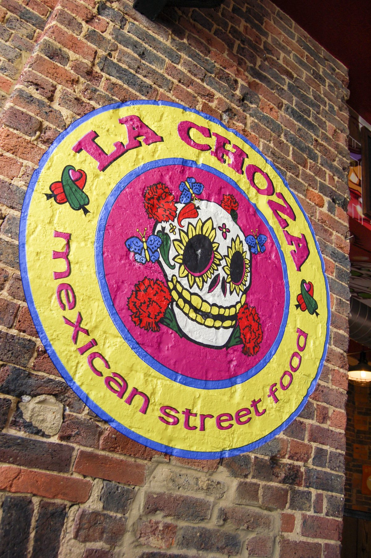
It’s time to toss out any generic signs and get branding savvy. The creation of a suite of signs that reflects your brand colours, logo and messaging communicates to internal and external customers and delivers a professional edge for your business.

Work with a professional designer to incorporate your existing branding or to work on a new personality for your signs. Customers want to connect with you as part of their experience and well-designed signs have a part to play in that personalisation.

Connecting online and offline signs

The chances are your business has a high level of social engagement. You probably use Instagram to post images of delicious plates and Twitter and Facebook to keep customers up to speed with specials and discounts.

You need to connect the dots between online and offline and make sure your social contacts are included in your signs, so your customers know where to find you online. Street signage is ideal for the task – include a witty or motivational phrase on your A-frame board and encourage your customers to share on your social networks to reinforce the message.

Explore vinyl wraps

If your business is based out of a food truck, then a vinyl wrap is a marketing opportunity you can’t afford to miss. Wrap your truck with images of tasty food or even your menu and you’ll stand out from the crowd.

But vinyl isn’t just for vehicles. This type of non-disruptive advertising is also perfectly at home in your bricks and mortar cafe. Add mouthwatering images, a thought-provoking message or some well thought out branding and your digital wallpaper will become an instant Insta trend.

Vinyl wraps or digital wallpaper are also ideal for time-limited campaigns or to make the most of your interior space. Eye-catching and engaging, this type of marketing is the smart way to make the most of every inch of your real estate, static or mobile.

Help your London food business stand out Now more than ever, it pays to have a serious sign strategy. Rather than sticking up a generic sign and forgetting about it, taking the time to understand how your business comes across to your customers and creating flexible signs that attract across a range of marketing channels will mark you out from the competition.

At The Sussex Sign Company, we specialise in maximising your return on investment, so contact us today to find out about flexible signs for your business.

Signage Design Trends You Need To Know About In 2019

Signage design in London is more important than ever. In fact, the biggest brands in the world are sitting up and paying attention to the importance of signs which means they’re now evolving into something new and exciting. From clever use of vinyl wraps and negative space to vintage and minimal design, the future looks bright.

Safety first

The love affair with glass in our public spaces shows no signs of diminishing with the transparent Tulip Tower set to become London’s tallest skyscraper. However, glass as a construction material has a raft of safety issues, not least of which is people walking into glass walls!

Anti-collision decals are a chic and practical way to prevent injury, but they can also be used to create industry-relevant displays and marketing while fulfilling their safety purpose. If you don’t have glass walls, create an eye-catching window display using vinyl.

Nice and easy

The days of over-complicated signage are over. For modern marketers, an interest in minimalism and pared back design is all about ease – no one wants to look as if they’re trying too hard.

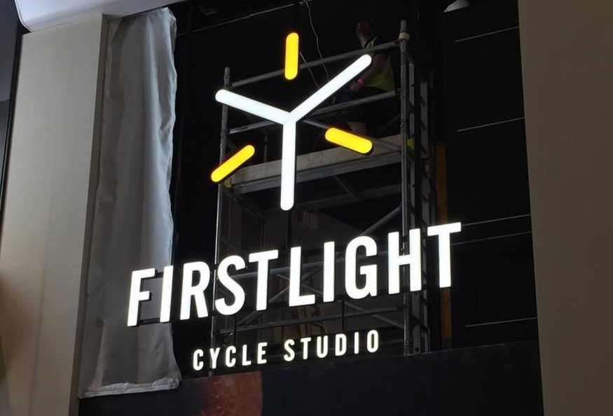
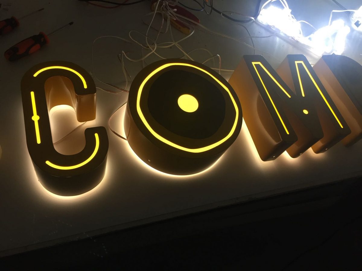
Out go over complicated logos and messages in favour of sleek and straightforward designs that communicate their message in a simple and uncluttered way. Channel letters and halo lighting are one smart way to keep your signs slick and contemporary.

Use negative space creatively

With the rise of digital wallpaper, there’s no excuse not to get creative with those blank walls. Inject some brand personality and key into the trend for bright pops of colour and bold graphics by making the most of all the negative space in your premises – especially if you have oddly shaped walls or curves that can really make the most of a quirky and eye-catching design.

Try one of the new dynamic and highly detailed hand-drawn style illustrations. Or be influenced by the mainstreaming of futuristic influences such as geometric shapes, abstraction and 3D. Colour palettes are moving away from muted minimalism to a new bright palette that’s intense and vivid, adding a real playfulness to your business graphics.

Go retro

Vintage signs are having a moment, their strong typography and fun colours keying into a sense of nostalgia that millennials find appealing. Think vintage painted designs and neon lighting then replicate the look in the latest materials using LED illumination for beautiful, long-lasting and sustainable signs.

Use bold and easy to read fonts that project individuality and innovation and don’t be afraid to move away from the overly professional to the relaxed and relatable – personalisation is set to be an even bigger part of the customer experience in the future.

Professional signage for your business

You may not be a mega brand but that doesn’t mean you can’t borrow some of their tricks. To keep your brand relevant over the coming year, please contact the Sussex Sign Company. We can advise you on a range of sign solutions designed to maximise the return on your investment thanks to our end to end service from design to installation.

5 Elements Of Effective Signage Design

Signage design is important so when you’re investing in new signs for your London business, you need to know that they’ll stand out from the crowd. From illuminated signs to wayfinding signage, how do you create eye-catching signs that really work? What are the elements that create successful signs that deliver a good return on investment?

Creating an effective and show-stopping sign is about more than carefully considering specific elements like fonts and colours. It’s about more than a sign simply looking good or being in the right place. Good signs are part of the story that your business tells about itself.

Aesthetics that create a connection

The way you convey your message can create an emotional connection with customers. A dull and plain sign can contain the same information as an aesthetically pleasing one, but a beautiful sign will always create more of a direct response in your customers. Be careful about the interplay of design elements and create something that is pleasing to the eye for maximum impact.

Supplying the right information

Signage design and information go hand in hand, with the essential information delivering the functionality to support the aesthetics. Ask yourself whether your sign includes the details you’d expect to see as a customer – is every piece of information essential, or can you reduce the amount of text yet communicate your message just as effectively, or more so?

Remember signage legibility and readability Beautiful graphics and punchy, well-chosen information will only take you so far. Now that you’ve captured your customer’s attention, they must be able to read your sign and absorb the information at a glance. However, it’s at this stage in the design process that things can go awry, particularly if you get the scale wrong. Charming graphic elements can assume monstrous proportions and elements can look out of whack with each other.

You should also be designing for accessibility. Design for your visually impaired clients and everyone will benefit from the clear and legible signs you create.

Boost your brand

However accessible your design, with perfectly balanced graphic elements and a strong, punchy message, you can still come unstuck. One of the benefits of creating successful signs is to boost brand recognition and identification. However, if your sign doesn’t connect with your brand, then it won’t connect with your customer to deliver that brand boost.

It’s not difficult to connect your brand with your signage – you can create consistency with the use of logos, straplines, brand colours and typography. If you’re not happy with those elements, then a new suite of signs could be the opportunity for a rebranding exercise.

Create a customer experience

Your signage design is all part of creating a welcoming environment that delivers a customer experience that’s superior to the other guys. By creating signs that are a seamless extension of your overall brand identity, you’re delivering another piece of the experience that customers will want to tweet and share.

Delivering effective signs

At The Sussex Sign Company, we’ll work with you to create effective signs that maximise your return on investment. Whether you’re in London or the South East, contact us and our end to end service will deliver signs that get Instagrammed and help you to create an experience that’s beneficial for your clients and your brand.

Getting The Most Out Of Your Seasonal Signage

It’s the season to be jolly and really nail your seasonal signage displays. Christmas is a huge opportunity for your business to get creative with your promotions and to design signs that really provoke your customers interest. Whether you’re wrapping a vehicle with a seasonal scene or creating a POS display with digital wallpaper, here’s how to give your brand a holiday twist and get the best out of your seasonal marketing.

Why you need seasonal signage

When you need to create eye-catching festive displays fast, signs are an easy way to make things happen. Banners and posters can feature traffic-building text that drives footfall through the door. Add a festive note to wayfinding signs with vinyl decals or use them to add seasonal marketing messages to your company vehicles.

Seasonal themed signs will attract your customers attention, increasing your ROI. Don’t forget to add a QR code or unique URL, so you can measure your most successful marketing strategies and build on them for your next seasonal campaign.

Think outside the box

Seasonal signs benefit from being used as part of a narrative, so decide on your story. Instead of Valentine’s, think Cupid’s Arrow, and instead of Christmas, think Nutcracker or the Snow Queen. The more sophisticated your theme, the more sophisticated and engaging the display you can create.

Turn on the lights

If you haven’t previously used illuminated signs, now could be the time to start. With low cost LEDs, you can create astonishing lighting effects with exceptionally low running costs. It’s a quick and easy way to add some pizzazz to both interior and exterior signs and it will help you to stand out on the high street.

Lighting effects should be bold enough to grab the attention of passers-by and hold it, so be bold. A combination of shape and colour can be used to great effect, especially if you think beyond the usual seasonal cliches to create some dazzling effects – if the competition are using red, change your signs with a bold fuchsia.

The benefits of seasonal branding

It’s relatively simple to up your seasonal branding game – an update to your website colours, promotional materials with a seasonal theme and a seasonal twist on your logo. Replicating these changes across your seasonal signage reinforces your branding and creates a consistent and professional image.

Tapping into the seasonal appeal can make your brand look active and dynamic and encourages that personal connection that all brands thrive on – think Starbuck’s famous holiday cups for inspiration. Changing your brand with a few tweaks and a focus on upgrading your signage can reap big benefits by reinvigorating your customers’ interest in your brand, resulting in greater engagement and an uptick in sales.

Season’s greetings

If your West Sussex business wants to make an impact this Christmas – or Valentine’s Day, summer holidays or Halloween – try thinking outside the box and exploring the huge range of signs designed to support your seasonal marketing efforts. At The Sussex Sign Company, we specialise in maximising the ROI on your signs all year round, so why not call us today or email our team and see how we can help you get the most out of your next seasonal campaign?

Best Practices To Boost Your Signage ROI

Signage best practices can be used to enrich the customer experience and reinforce your brand. But how do you create well designed signs that enhance success for your West Sussex business, while delivering a quantifiable return on your investment? These are the three most effective strategies that can help you integrate signs as part of a successful business strategy.

Integrate signs into your design strategy

Well thought through and designed signs can make a contribution to the customer retail experience that can be directly evaluated in increased sales. The trick is to deliver clear and consistent branding and uniquely dynamic displays that attract consumers and become part of your brand equity. Following best practice for readability, informational clarity, uniqueness and viewing enjoyment can directly impact on the success of your signage and your bottom line.

Keeping you user at the heart of the design strategy can be a primary factor for success. Starting with defined user personas, your design should respond to the way your customers think and act. Iterative design processes deliver signs that enhance the user experience to retain existing customers and attract new ones.

Value propositions and signage

Make it part of your business strategy to award excellence in sign creation. Focus on engaging all stakeholders from the local community to develop unique design strategies that engage and drive both brand recognition and customer loyalty. Never look at sign development in isolation, but always as part of a deeper commitment to enhancing the customer experience and the local built environment.

Using experienced professional designers will allow you to embed great design at the heart of your brand signage strategy. Visualising and implementing design solutions that are closely mapped to the customer experience will build excellence into the design process and help to optimise your return on investment.

Increase collaboration

Signs don’t exist in a vacuum. In fact, they’re increasingly integrated into the architectural elements of the retail environment. Advances in the way that signs are fabricated and the materials used have raised the profile and value of signs, creating high quality landmark elements and unique environments for high concept stores.

High quality signs that are manufactured and installed effectively will reinforce the quality of your brand and should be central to your marketing strategy. Leading retailers who are design-centric and who focus on developing great signs can expect a three times higher return on investment per square foot of retail space than businesses that don’t pay attention to attributes like legibility, appropriate scale and viewing pleasure in their signs.

Using end to end services to boost your ROI

At The Sussex Sign Company, we offer a fully integrated signage service. This means that we can guide you through every part of your sign’s development, from design to installation. That leaves you free to develop user profiles and research the user experience to develop effective design strategies for our graphic artists to implement. We’ll collaborate with you at the manufacturing stage to ensure that your signs are created from the most appropriate materials to enhance the value of your premises and create a unique architectural feature that gives your business the edge. If you want to find out more about maximising your ROI with integrated sign services, contact us today.

5 Ways To Update Your Current Signage

Update your signage! Is your fascia looking a little tatty or does your signage no longer reflect where you are as a business? There can be several different reasons for needing to update your signage – so here are 5 ways to help you keep your signs looking fresh, to stay ahead of the competition.

Try rebranding

Even the biggest corporations undergo regular rebranding, no matter how subtle. How you handle a rebrand can turn it into a useful marketing opportunity and allow you to create a cohesive look for your commercial premises that might even extend to your vehicle fleet.

Whether you keep it as subtle as an overhaul of your colours and fonts or go for a full-scale change of logo, a well-executed rebranding exercise can generate sales, increasing revenue to pay for the change of look.

Update materials

The chances are that, since your signs were installed, the materials used have advanced significantly. Investing in premium quality signs is your ultimate marketing tool. If your signs can withstand extreme weather conditions and come up shining, then they’re worth the investment.

Coupled with a planned maintenance programme to keep your exterior signs in good condition, you’ll boost brand awareness and business reputation. When your signs look good, your premises are more attractive to your customers.

Expand your signage

Instead of replacing your existing signs, you can update your signage and rejuvenate the look and feel of your premises by adding extra signs that benefit your customer. Additional wayfinding signs can direct customers to promos and retail opportunities that enhance the customer experience while boosting your revenues.

You could also consider adding point of sale signs and displays that direct customers to a time limited promotion or a new product you’re keen to bring to their attention. The sales you generate with additional signs can offset the costs of your investment.

Add illumination

An illuminated sign means that you can truly maximise your marketing appeal, 24/7. Energy efficient LEDs have made sign illumination a feasible choice for any business and there’s no doubt that well-constructed halo letters with a strong illumination effect will set you apart from the competition and give your signs an instant update.

A cost-effective trough light is a quick and easy way to add a different dynamic to an existing sign. From halo lighting to the use of large scale monument signs packed with LEDs, ask your sign designer for their expert advice and add the power of illumination for a quick facelift.

Rethink design

If you want to create a whole new signage suite, then you’ll want to rethink everything from the ground up. Working with a professional designer is the savvy way to focus your ideas and maximise your return on investment. After all, a set of new signs may not come cheap, but as your biggest marketing asset, they offer surprisingly good value for money.

Whether your business needs an overhaul or your nearest competitor in West Sussex has signage that’s putting yours to shame, we can help. At The Sussex Sign Company, we make it our business to help you maximise your ROI with bespoke signs that help you utilise this piece of prime marketing real estate to its fullest potential, so contact us today.

What’s The Truth About Branding And Signage?

What is the truth about branding and signage and branding.

Want to stand out from the competition? Need greater brand recognition? Then you need exterior and interior signs that are clear, coherent and well-designed. Of course, you’ll have to do that yourself because no sign company is capable of creating the great design you need to differentiate yourself in a crowded market.

That’s a myth. In fact, a professional sign company can offer you the ultimate solution to your branding and design dilemmas. By having your sign company design, create and fabricate an entire custom sign package, you’ll maximise efficiency, streamline costs and minimise hassle.

Branding: art or science?

Branding is a unique blend of research and design that leads to the development of clear and imaginative marketing. Impactful signs are central to any coherent branding exercise and a strategic signage partner will guide you through the process, helping you explore the design options and make the right decisions on materials. Your partnership will lead to the fabrication of cost-effective signs that form a central part of your branding strategy.

Business led branding

Ever hear the expression ‘less is more’? Your business should dictate the marketing and design strategy for your brand. For some businesses, minimalism reflects their business values – think Apple design. But for your business, you may prefer to take a more playful, colourful and maximalist approach, because it chimes with your branding.

But you should also beware of keeping signage to a bare minimum. Again, let the customer experience dictate the number and type of signs that you need, from exterior illuminated signs to interior wayfinding services. Don’t compromise the customer experience because you feel you need to conform to a certain design stereotype. Let your sign company lend their expertise to your evaluations and needs analysis.

Beautiful branding vs the real world

There’s a common misconception that conforming to accessibility standards for signs is anathema to great design. In fact, so-called great design or branding is no such thing if it’s not flexible enough to be accessible to all.

Working with a sign company is the smart way to combine form and function in such a way that style doesn’t compromise readability and vice versa. Through consultation and thoughtful design, your branding can stay on point, whatever the style of signage, to deliver clear, consistent and clever branding.

In fact, paying attention to the use of pictograms and being sparing with text can help you to create signs that are inclusive, effective and visually appealing. When it comes to words, less is very definitely more and signs are no place for verbal overload. Use short headlines and keywords and be sparing with words – leverage the power of imagery to tell your brand story and focus on the quality of images to create an impression and sustain brand recognition.

Find your strategic signage partner

Rising above the visual noise can be particularly hard in a major city like London. But it’s not impossible if you partner with a sign company with the expertise to help you leverage your signs to create that all important brand recognition. At The Sussex Sign Company, we’ll help you maximise your return on investment and help you get the best out of your branding, so contact us today.

Commercial Wayfinding 5 tips to make your signage a success

Good commercial wayfinding signage is all about putting your customer at ease in an unfamiliar space. Wayfinding should be intuitive and consistent – there’s nothing worse than allowing your signs to develop into a mash-up of styles, fonts and colours. If you’re renovating or remodelling, then now is the ideal time to reconsider your wayfinding strategy using these 5 top tips to success.

Keep it simple

You don’t have to spend a fortune to create a suite of informative and user friendly wayfinding signs. In fact, this is one area where digital isn’t better. It’s virtually impossible to set digital signage to please all customers – some will be frustrated if information scrolls too quickly, others if it’s too slow.

Make it easy for your customers to process information and get to where they’re going. Put yourself in their shoes and walk the building – how many times would you have to ask for information because a sign is unclear? Are signs displayed at the right height? And are they accessible for all your customers? By keeping your signs as simple as possible, you’ll satisfy more of your customers.

Pictures not words

It’s still true that a picture get the message across much more quickly and easily than words, and we retain that information for far longer. Pictograms are also the smart choice if you have a multilingual customer base, which is why they’re in common use for toilets, waste bins, cafes and restricted behaviour – why bother writing ‘No Smoking’ when the pictogram does the job?

The customer experience

In commercial spaces, things are often in flux and that can negatively impact on the customer experience. Designing for interchangeability is a smart way to save time and money and ease customer frustrations. Creating clear and concise signs is an easy way to enhance the customer experience and drive repeat business, while giving your customers the information they need.

Tried and tested commercial wayfinding

It’s tempting when revising your wayfinding sign strategy to go digital or try and get overly creative. Don’t – save the creativity for shop floor displays and stick with tried and tested sign solutions like colour coding. However old school it might seem, it works in a way that digital can’t match – there is a pre-established visual vocabulary that lets the customer see at a glance what the sign is for.

Don’t forget branding

Although commercial wayfinding signs are always designed with a purpose, that doesn’t mean you have to neglect your branding. Keeping consistency throughout your entire suite of signs from shop front to toilets helps to establish a pleasing aesthetic based on your brand colours, fonts, logos and other key design elements.

Commercial premises often overlook it, but this is an opportunity for branding that you shouldn’t miss. Reinforcing your brand package looks smart and attractive and gives your long term customers added confidence.

Ask the experts

At The Sussex Sign Company, we have plenty of expertise is creating suites of signs that deliver the kind of customer experience that will keep them coming back for more.

We can advise your West Sussex business on every aspect of signage, helping you to create a memorable visual aesthetic and maximise the return on your investment. Contact us today to talk about your project.

Estate Agent Signs And The Regulatory Landscape

Before you order your estate agent signs in East Sussex, Brighton or across the country, it pays to know the regulatory landscape. This will ensure you don’t fall foul of increasingly steep fines.

The code of practice, as laid down by the property ombudsman, is clear – you must not erect any form of for sale board at a property unless you’ve been instructed to sell it, and you must conform with the Town and Country Planning (Control of Advertisements) Regulations 2007, which is very specific about the size of boards and the amount of time they may be displayed.

The problem with signs

Legislation restricting intrusive and multiplying signs is nothing new. In fact, London first introduced a law restricting signboards in the 1700s. Although things have moved on since the days of every tinker, tailor and candlestick maker advertising their wares with gigantic hanging signage, there’s no doubt that a plethora of estate agent signs can be a nuisance and some councils have considered banning their use entirely.

Know the law

The legislation governing estate agent boards can be quite confusing, especially as it pertains to the permissible size of any temporary advertising. That’s why boards are created in standard sizes using low-cost corrugated board, which in theory means that they are cheap to repurpose or start afresh. However, in areas where there is a high turnover of rented accommodation, signage can be left in place for months, creating a real eyesore.

The law states that estate agent signs must be removed within 14 days of a property being sold or let, otherwise a penalty charge notice of £1000 will be issued. Councils have traditionally been lax at enforcing PCNs, but recent changes to the amount they may keep from their enforcement mean you could fall foul of the local planning office to the tune of several thousand pounds if you don’t remove your signs within the permitted time.

The problem with spam boards

Spamming has recently become a problem, with one London agent using local community events to erect advertising boards that flouted the regulations. These so-called ‘spam boards’ featured the agent’s name in large letters and looked just like a standard estate agent board. Many were even erected illegally outside properties without the owner’s consent.

In Bath and Brighton, total bans on estate agent boards have been implemented. A ban has also been trialled in other areas.

Why you need lawful estate agent signs

It’s not all bad news. Lawful signs that comply with regulations and are taken down within the 14-day limit are still one of the most effective ways of advertising property for sale or rent. They attract the interest of buyers and remain the most obvious and appealing way to advertise.

At The Sussex Sign Company, we can help you create eye-catching boards that will attract passers-by and motorists to come and view your properties. Using the most advanced and cost-effective materials, we can help you create the impact you need to get that quick sale. Contact us via phone or email for more information and advice.

Why Outdoor Signage Is As Important As Facebook

Facebook, Twitter and Instagram. You know you need to have a social media presence, but for a high street business, high-quality signage is still a savvy marketing strategy. Nothing builds brand awareness like outdoor signs that are well-designed, well-executed and displayed correctly.

Visual communication

While your Facebook page can build your digital profile, nothing brands you in your community like a sign above your premises. That’s what your potential customers walk or drive past on a daily basis, and it creates brand awareness and provides vital visual communication. It’s that communication that can be critical for the success of your business.

Signs let potential customers know where you are and that you exist – 76% of respondents to a recent FedEx study said they visited a store they never knew existed because of its sign, and 75% were happy to recommend a business based on its sign. Those numbers are too persuasive to ignore.

Your sign is not dependent on SEO to make an impact, and it can stand out in all weathers, creating thousands of impressions that Facebook just can’t match.

Is bigger signage better?

Size matters when you’re designing a sign – the sign itself, the objects that contextualise it and the size of the font. An oversized sign can detract from the message, whereas a small, well-placed sign can create a bigger and better impact than a larger one.

Some types of sign are already restricted in our cityscapes, including estate agents signboards. In fact, the overall size of the sign is not as important as the message that your sign conveys, thanks to the complicated and complex way we sequence and process a sign when driving or walking past.

What makes offline branding the right fit for your business is the unique value proposition that this kind of differentiation delivers for your business. Be bold but restrained and you’ll make maximum impact.

First impressions count

Your signage delivers the fundamentals of your branding in the blink of an eye. Therefore, creating that killer first impression through your signs means approaching them in the manner of an elevator pitch. If your pitch works, your customer will step inside, but that can only happen if your signs are consistent, clear and concise, with enough interest to draw your customers in.

Be seen

With Google rumoured to be building an ad-blocker directly into the next version of Chrome, the chances of getting your online ads seen are diminishing. With 26% of your audience already using ad-blockers, is your message getting through?

Using signs, you can communicate directly with your potential customers, thanks to their visibility and clear call to action. If static signs don’t work with your business, consider using vinyl car wraps to create thousands of impressions for just a few pence.

Ask the experts

When you’re looking to create high impact signage in West Sussex, it can be tough to get the messaging and design right. But when great signs can have as big an impact as your Facebook presence, why not ask the experts? At The Sussex Sign Company, we can help you maximise your ROI for signs with a greater reach than online marketing alone. Contact us today via phone or email and we’ll be happy to help.