How long did it take you to get the design for your ecommerce site right? And the signage for your bricks and mortar premises in London? The fact is physical signs should never be an afterthought – they’re an important part of your sales team.
Signs can help your customers navigate your store, attract them to promotions and give valuable information. You pay close attention to the way your website looks. keeping it consistent with your branding. Paying the same attention to your signs will really pay off.
Getting your signage right first time
Before you start designing your signs, take a tip from the advertising business and narrowcast your message. By defining your ideal customer, you can target the right graphics and messages to make your signs effective and eye-catching.
– Keep it simple: the most effective signs have a clear and simple message. Too much information can be confusing and your signs will be ignored. If you can’t convey your essential message in 5 seconds, then shorten it or consider using more than one sign.
– Write a headline: use an effective message hierarchy of attention-grabbing headline, concise explanatory text, and a punchy call to action.
– Always add a call to action: every sign needs a simple, effective call to action that gets the customer to do something like call or visit your website.
The four signs you can’t ignore
Exterior signs
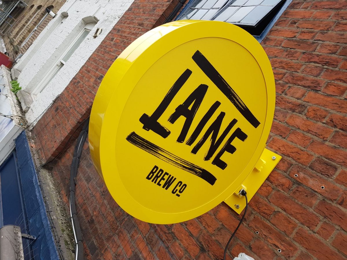
Whether you have a simple A frame outside your coffee shop or illuminated channel letters over the door, this is arguably your most important sign because it’s the one that captures your customers’ attention and gets them through the door.
These signs need to be branded effectively to convey an idea of the experience the customer can expect when they walk through the door. And they should make them want to cross the street to experience it.
Information signs
Wayfinding signs help your customers navigate easily around your premises and find what they’re looking for. Never underestimate convenience when it comes to attracting and retaining customers.
Once you start positioning your signs, you’ll become aware of any organisational snags that your customers will find frustrating, and can put them right. Keep these signs bold and colourful, but consistent with your branding.
Communicative signs
These will let your customer know about sales and promotions or they can showcase a new product. Done well, they can increase brand awareness, drive sales and even add a higher perceived value to a product.
Inclusive signs
When you’re appealing to customers, you need to be inclusive. That means complying with accessibility legislation not just in car parks and toilets but in the way you use your signs.
Signs should be both legible and readable and use pictograms and/or Braille where appropriate. Use san serif fonts and high contrast colours for the most effective signs and make sure they’re mounted at the correct height.
Effective signs for your store
If your retail premises need a new suite of exterior and interior signs, we can help. At The Sussex Sign Company, we have the experience and expertise to design, create and install signs that raise brand awareness and attract attention. Contact us today for signs that maximise your return on investment.

