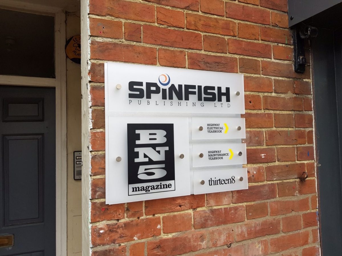
Wayfinding signage is essential in cities like London, where the ability to navigate on foot is paramount. In fact, the term wayfinding was coined in the 1960s as part of a study into what became known as ‘city legibility’.
Of course, the capital already has one of the most easily recognised and useful wayfinding documents in the world. The underground map not only makes navigating the transport system a breeze, but 45% of pedestrians also find it a valuable aid to walking the city.
The 2012 Olympics saw efforts to put a coordinated wayfinding scheme in place across the capital, with a suite of walking and digital maps and a smartphone app creating a unique and cohesive visual identity that made the city easy to navigate. So what can your business learn from this city legibility experiment?
Ask the right questions
When you’re designing a wayfinding scheme for your business, you need to understand your clients’ needs. Imagine the silent questions that they will ask when navigating your premises – your signs should be able to answer more sophisticated enquiries as well as the basics.
Putting yourself quite literally in your clients’ shoes and walking your site will give you the level of detail and understanding you need to answer those questions and determine the clearest routes.
Be consistent and accurate
The best wayfinding signage allows for seamless navigation so the client arrives where they need to be almost without realising it. The city legibility scheme achieved a consistency of look across its suite of signs and apps to guide visitors to discover the city without being nannied.
Where it sometimes fell down was on the accuracy of the signs and their measurements. City dwellers have complained of inaccurate information and even signs mounted the wrong way up. Attention to detail and accuracy is critical whether you’re providing signs for identification, direction or information. Focusing on effectively orienting your clients will make navigation as easy as possible.
Focus on creativity and innovation
One thing this legible city scheme got right, and that has made it a gold standard for similar schemes across the world, is the flawless blend of creativity and innovation. The scheme made use of apps and technology to make digital signage more appealing and effective and the monolithic column design created a series of landmarks for easy orientation.
Combining fun and functionality allows you to inject your business personality into your wayfinding signs, or lets you inject some of your online presence into your offline world. Colour coding, unique branded imagery and compelling themed graphics that integrate with your company’s USP will all attract your visitors’ attention and create a compelling and creative scheme.
High quality wayfinding signage
Of course, navigating the complexity of a big city presents challenges that wayfinding for your office complex or retail premises are unlikely to face. But that doesn’t mean you can’t take the key findings of a legible city scheme and incorporate them into your own seamless scheme.
If you’re interested in finding out more about creating wayfinding signs that reflect and reinforce your brand image, while getting your clients and customers where they need to go, contact The Sussex Sign Company today.

