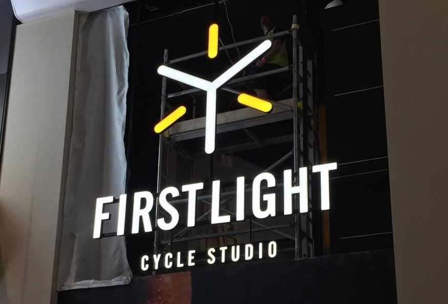
Signage design in London is more important than ever. In fact, the biggest brands in the world are sitting up and paying attention to the importance of signs which means they’re now evolving into something new and exciting. From clever use of vinyl wraps and negative space to vintage and minimal design, the future looks bright.
Safety first
The love affair with glass in our public spaces shows no signs of diminishing with the transparent Tulip Tower set to become London’s tallest skyscraper. However, glass as a construction material has a raft of safety issues, not least of which is people walking into glass walls!
Anti-collision decals are a chic and practical way to prevent injury, but they can also be used to create industry-relevant displays and marketing while fulfilling their safety purpose. If you don’t have glass walls, create an eye-catching window display using vinyl.
Nice and easy
The days of over-complicated signage are over. For modern marketers, an interest in minimalism and pared back design is all about ease – no one wants to look as if they’re trying too hard.
Out go over complicated logos and messages in favour of sleek and straightforward designs that communicate their message in a simple and uncluttered way. Channel letters and halo lighting are one smart way to keep your signs slick and contemporary.
Use negative space creatively
With the rise of digital wallpaper, there’s no excuse not to get creative with those blank walls. Inject some brand personality and key into the trend for bright pops of colour and bold graphics by making the most of all the negative space in your premises – especially if you have oddly shaped walls or curves that can really make the most of a quirky and eye-catching design.
Try one of the new dynamic and highly detailed hand-drawn style illustrations. Or be influenced by the mainstreaming of futuristic influences such as geometric shapes, abstraction and 3D. Colour palettes are moving away from muted minimalism to a new bright palette that’s intense and vivid, adding a real playfulness to your business graphics.
Go retro
Vintage signs are having a moment, their strong typography and fun colours keying into a sense of nostalgia that millennials find appealing. Think vintage painted designs and neon lighting then replicate the look in the latest materials using LED illumination for beautiful, long-lasting and sustainable signs.
Use bold and easy to read fonts that project individuality and innovation and don’t be afraid to move away from the overly professional to the relaxed and relatable – personalisation is set to be an even bigger part of the customer experience in the future.
Professional signage for your business
You may not be a mega brand but that doesn’t mean you can’t borrow some of their tricks. To keep your brand relevant over the coming year, please contact the Sussex Sign Company. We can advise you on a range of sign solutions designed to maximise the return on your investment thanks to our end to end service from design to installation.

