Vehicle Wrapping: What’s Your Inspiration?

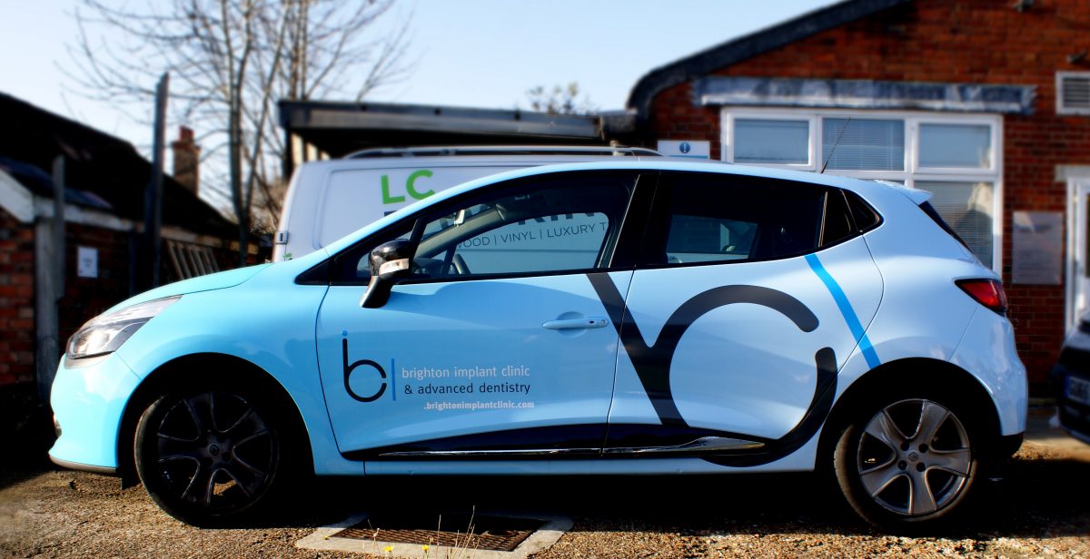
It’s a bold statement, but your London business needs vehicle wrapping. Without it, you’re missing out on low-cost marketing with a massive return on investment. With anywhere between 2,000 to 9,000 impressions per hour and no ongoing costs once your wrap is installed, the benefits of a well designed wrap are enormous.

But where do you start when it comes to getting the inspiration for a great design? It’s one thing to decide a vinyl wrap works for you, but quite another to create a design that maximises all the benefits and advantages of a vehicle wrap.

These five tips will help you to pull together design inspiration that helps you get the best out of your wrap. After all, first impressions count!

Google it

It seems obvious, but there are so many great designs out there, it’s a snap to simply Google your design inspiration. However, it pays to do some research and to make sure that you google images that relate to your vehicles.

You can find plenty of attractive and eye-catching layouts, but they need to work for your make and model. Otherwise, you run the risk of the message getting lost because the design elements aren’t correctly placed.

Your favourite artist

Any wrap should be bright and bold in order to make an eye-catching impression. Take inspiration from a favourite artist or designer to create imagery that grabs your audience’s attention and doesn’t let go.

One word of caution: don’t confuse bold with busy. A cluttered or over complicated image can be distracting or difficult to take in and your customers will switch off. Choose imagery that’s consistent with your brand colours and that enhances your message.

The competition

Obviously, you don’t want to simply mimic what the competition is doing, but you can get inspired by it. When you see a wrapped vehicle around town, what catches your eye? Is it readable? Does it accurately reflect the products or services on offer or are you none the wiser about the message?

Look to major established brands for indicators on how to get it right. These are the brands who’ve weathered the test of time – draw inspiration from branding that is instantly recognisable in a few seconds.

Your story

What’s the story your business is trying to tell your customers? This is all about the core values you want to convey symbolically so that you provoke a direct emotional response in your customers. Start with your logo and brand colours and create your narrative.

Fortunately, when you work with a professional signage company, there are no limits to what your vehicle wrap can achieve.

Inspiration for your vehicle wrapping

At The Sussex Sign Company, we can help you find the right inspiration for your vinyl wrap, so that you stand out in London traffic. We’ll help you tell your story and make the connection with your customers to give your brand an identity boost. Vehicle wraps are the ideal canvas to create brand recognition and maximise your return on investment, so why not get in touch with us today? We’ll help you get inspired to create that killer design that sets you apart from the competition and drives your business forward.

Signage Choices: Why Your Office Needs Digital Wallpaper

When a client enters your London office, what impression does it make on them? If your first impressions could do with smartening up, consider new signage in the form of digital wallpaper.

This is the innovative way to combine colour, pattern and corporate messaging in one aesthetic package that delivers real design punch with a host of other benefits that paint and decals can’t match.

If your office lobby is crying out for visual appeal, then digital wallpaper might just be the smart choice when you need to make a great impression.

Premium appearance

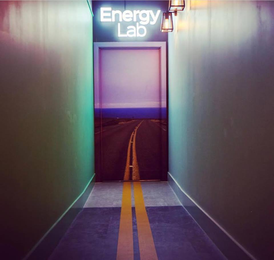
There’s no doubt digital wallpaper is firmly on trend. There are no limits to how you can dress your walls or the graphics you can use to create the right atmosphere, from abstract designs incorporating your logo to more overt corporate messaging. You can turn your lobby into anything from a tropical beach to an urban skyline with a bespoke digital wallpaper.

This combination of style, concept and cutting edge technology effortlessly creates visual impact and a premium appearance.

The budget option that isn’t

Paint might seem the cost-effective option and you’d be right – in the short term. But if you want to think long term and look as if you do, then investing your budget in digital wallpaper can give you a much better return. Paintwork can quickly look tired and scuffed, requiring regular retouching and a full blown revamp in as little as 3 years.

Opt for digital wallpaper and you can make over your office and deliver that all-important first impression of professionalism. A fresh, bold and timeless design that incorporates your logo, branding colours and other strong messaging elements will outlast paint by up to five times. That means your lobby continues to look fresh and smart when paint has already begun to look shabby, and definitely not chic.

Conceal your flaws with digital wallpaper

Cracks, flaws, damage – when you paint your office walls, there’s no hiding place. If the preparation isn’t right, then the finished result will always look rough and uneven – hardly the slick and professional face that your business wants to show to the world.

And that’s where digital wallpaper has the advantage. Excellent at concealing flaws and imperfections, this type of signage is ideal for creating an emphasis wall that focuses the attention of prospective clients on your brand.

Investing your budget in a bespoke design will create a consistent and dynamic interior that delivers a message about your professionalism and success as a business. When you have a captive audience, there’s no better way of generating brand recognition and awareness as an introduction to your business.

Maximise your return on signage investment

If you want to create an effortless brand identity that really maximises the return on your investment, digital wallpaper is a savvy choice. There’s no waste because we only print exactly what you need, meaning you’re not paying for any leftover materials. And the impact of a bespoke design will speak volumes about your business for years to come.

Interested in what digital wallpaper can do for your business? Get in touch with The Sussex Sign Company today to discuss your options.

Signage Trends That Make Your Business Instantly Instagrammable

Social media is a brilliant tool for building your brand. With 3 billion people worldwide now using social channels to directly connect to their favourite brands, shares and likes are some of your best marketing weapons. If you’re not working these signage trends, and you are a business in a major global city like London, can you afford not to have a business that’s Instagram-ready. Is your signage up to the job?

If you’re a business that relies on social interactions, then you’ll know that Instagram is one of the best social media platforms for business, with over 71% of global Instagrammers falling into the 35 and under demographic. There’s also a near perfect crossover with YouTube, with 95% of Instagrammers also using the video platform. That’s a lot of influence.

So where do signs fit into the equation? If you’re encouraging customers to snap and share, you need your branding to be absolutely on point. If a picture paints a thousand words, tired and worn looking signs are a quick way to put a dent in your brand image when they’re all over Instagram.

Signage: is yours Insta worthy?

If social is part of your marketing plan, then it pays to step outside of your business and ask yourself some questions. Try snapping some selfies with your signs in the background – do they look exciting, fresh and inviting, or could you be doing better? Do you need additional signs to create a more customer-friendly experience or could your entire branding do with a makeover to create a more Instagrammable result?

If you’ve dismissed Instagram as a platform for your business, here’s a statistic to make you think again. 60% of Instagram users – that’s upwards of 600 million people daily – search for new brands and products on Instagram. Is that a market your business can afford to miss out on? Are you picking up on these signage trends?

Get started by looking for similar businesses and seeing how they use their Instagram account and the kinds of images that guests are taking and posting. How does your signage measure up? Whether your brand would benefit from a minor refresh or a major overhaul, putting yourself in your customer’s shoes will give you the advantage of making yourself Instagram friendly.

Getting up to speed

If influencing Instagram is your goal, then investing in new signs and impactful branding is critical. If your aim is to get your brand on a social platform in a way that positively impacts your marketing, then you need to work with the professionals to create consistent and eye-catching signs that are worth sharing.

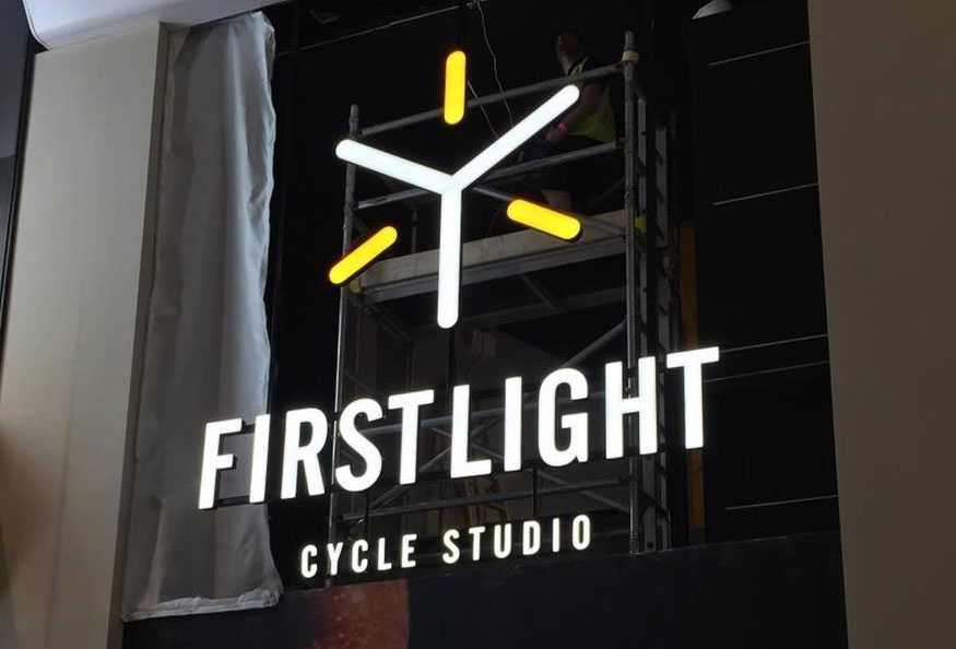
Consider illuminating your signs with low energy, low cost LEDs to ensure they’re well lit and more than just the background to a customer’s selfie. Innovative lighting effects created with channel letters allow your sign to project a message at all times of the day and night.

Professional signs in Sussex

At The Sussex Sign Company, we can create the kind of signs that influencers will take notice of. We can help you stand in your customer’s place and create branding that makes the most of Instagram’s social reach. Contact us today for more information on new signs for your London business.

Signage For Real People, To Maximise Your Event

If you’re holding an event in West Sussex, are you overlooking the basics such as your event wayfinding signs? These signs can help your guests move smoothly from place to place, which is why you need to put yourself in their place. People can get lost or become overwhelmed by the sheer scale of an event. Or they might just want to know how to get to the bathroom. By using well thought through signage that stays consistent with the branding of your event, you can help to manage what is often an undervalued aspect of your event.

Branded event wayfinding signs create a less stressful event. That in turn helps to optimise the event experience and creates positive feedback. By taking a visual approach to the challenges of event organisation and flow control, you contribute to a more organised environment for your guests.

Walk in your guests’ footsteps

Successful navigation depends on siting signs where your attendees are likely to see them when they need them. Directional signs for amenities like the restaurant or bathroom should be situated throughout the event, not confined to within a 10 feet radius of those locations. Walk through the layout in your guests’ shoes, asking the questions they’re likely to ask. That will help you to fine tune the positioning of your signs.

Use your branding wisely

Your signs need to be bold, bright and easy to read at a glance, otherwise the experience can quickly become frustrating rather than enjoyable. If your brand colours are suitable for creating easily readable signs, then use them. However, if they make your signs illegible, stick to approved high contrast accessibility colours and limit your branding to your logo. When you’re designing wayfinding signs, best practice in readability and inclusivity should always be your guide.

Keep signage simple

While it’s tempting to want to create a brand personality with your signs, you need to remember their primary purpose, which is to inform and guide your attendees. By all means, add your logo and use your branding fonts, but never let them obscure the message. Keep wording to a minimum and use universally recognised pictograms wherever possible. Only use personalisation where it’s appropriate and where it won’t obscure the primary function of your signs.

Think through arrows

Arrows are a part of the visual language of wayfinding, but think carefully about the way you use them. Never rely on them as the sole means of navigation and make sure that when you do use them, there’s no ambiguity in what they’re indicating. In fact, you may be better to use multiple signs rather than rely on arrows that could be interpreted in several different ways.

Professional wayfinding signs for your West Sussex event

When you need to create the right impression and ensure that you event is managed properly, you need to work with a professional sign company. At The Sussex Sign Company, we’ll discuss your wayfinding signage needs and put together floor and wall signs, A-frames and banners that help to create the optimum attendee experience. You’ll work with our professional designers to create the perfect signs for your event and to solve the challenges of event organisation with a visual communication solution that really works. Contact us for more information and advice.

Vehicle Livery: What It Is And Why You Need It

If you want to align your East Sussex business with 21st century marketing, you need vehicle livery. Offering low costs per impression with high impact branding, this type of advertising is ideal for small businesses who need a cost-effective way to reach their target audience. If you don’t want to be just another business with a generic white van, vehicle signwriting can differentiate you from the competition and keep your business top of mind for your customers.

What is vehicle livery?

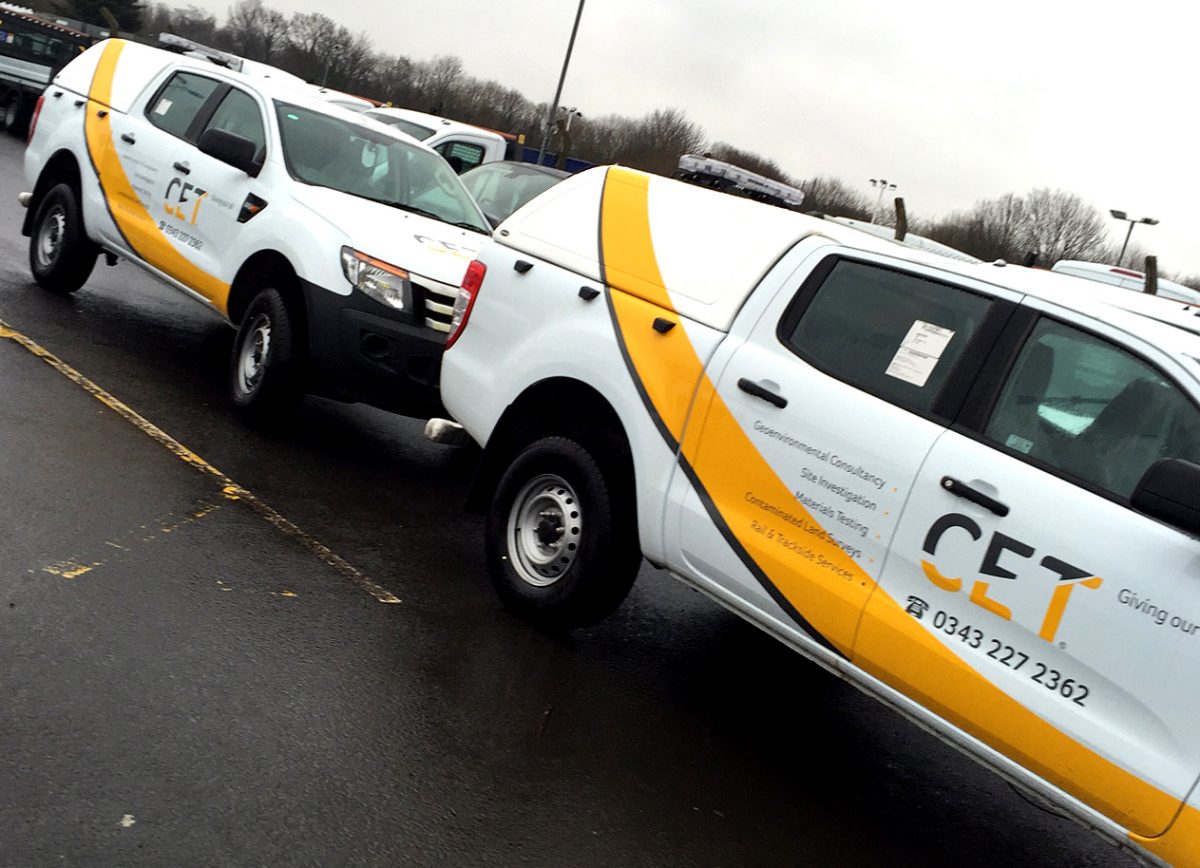
One of the most cost-efficient ways to create a strong brand identity, vehicle wrapping make the most of what is most often under utilised advertising real estate. Imagine creating a consistent branded look across your premises, your website, your print assets and your vehicle that reinforces brand recognition.

Now imagine pushing that out to your target audience 24/7, whether you’re parked outside a client’s house or on the move. Whether you choose a durable vinyl wrap or decals that shout out your contact details, your mobile advertising goes where your shopfront can’t.

Why does my business need vehicle signwriting?

Because you already own your vehicle, the only expense involved is the cost of the wrap itself. After that there are no oncosts – maintenance is a simple case of keeping your wrap clean and out of direct sunlight.

You’ll also benefit from the obvious professionalism that vehicle signwriting confers on your business. Investing in this type of vehicle personalisation tells your clients your business is here to stay and that’s reassuring. After all, with the average lifespan of a professionally produced and installed wrap being anything up to 8 years, you can expect a long lasting return from your initial investment.

What type of vehicles can be wrapped?

Whether you have a company Smart car or a fleet of vehicles from motorbikes to lorries, you can get your vehicles wrapped. Obviously, truck wraps are the most effective for their sheer size and impact, but applying consistent branding across a fleet can have a massive impact, whatever the size of the vehicle.

That’s not to imply that smaller vehicles can’t also create a buzz. Head-turning vehicle graphics are instantly Instagrammable and will draw potential customers’ attention to your branding whether they see it on the road or online. In fact, vehicle wrapping can be a savvy choice for your works van because it’s constantly in view.

What about design for vehicle livery?

To be honest, this is not a project that you’ll want to DIY. And because it’s a one-off investment it really does pay to work with the professionals to achieve the best results. You need to take the angles and curves of the vehicle into account when creating a wrap design and a professional designer will have the experience to create a unique and bold design that puts you head and shoulders above the competition.

If vehicle livery is a good fit for your brand, then get in touch with us at The Sussex Sign Company. We can offer an end to end service that takes your vehicle from blank canvas to professionally wrapped brand enhancer to help you optimise your brand identity across East Sussex and beyond.

Signage: 3 Trends Your Food Business Needs To Know About

If you own a food business in London, you’ll constantly be on the lookout for savvy marketing to give you the edge. Sometimes it pays to go back to basics and take a look at the way your signage is performing when it comes to advertising your cafe, pop up or food truck.

Your signs are still the best way to differentiate your business. But to make you stand out from the crowd, you need to make some intelligent decisions about the signs you use to get customers to queue around the block for your food. These are just some of the biggest food sign trends that you’ll want to make the most of.

Branding your signage

It’s time to toss out any generic signs and get branding savvy. The creation of a suite of signs that reflects your brand colours, logo and messaging communicates to internal and external customers and delivers a professional edge for your business.

Work with a professional designer to incorporate your existing branding or to work on a new personality for your signs. Customers want to connect with you as part of their experience and well-designed signs have a part to play in that personalisation.

Connecting online and offline signs

The chances are your business has a high level of social engagement. You probably use Instagram to post images of delicious plates and Twitter and Facebook to keep customers up to speed with specials and discounts.

You need to connect the dots between online and offline and make sure your social contacts are included in your signs, so your customers know where to find you online. Street signage is ideal for the task – include a witty or motivational phrase on your A-frame board and encourage your customers to share on your social networks to reinforce the message.

Explore vinyl wraps

If your business is based out of a food truck, then a vinyl wrap is a marketing opportunity you can’t afford to miss. Wrap your truck with images of tasty food or even your menu and you’ll stand out from the crowd.

But vinyl isn’t just for vehicles. This type of non-disruptive advertising is also perfectly at home in your bricks and mortar cafe. Add mouthwatering images, a thought-provoking message or some well thought out branding and your digital wallpaper will become an instant Insta trend.

Vinyl wraps or digital wallpaper are also ideal for time-limited campaigns or to make the most of your interior space. Eye-catching and engaging, this type of marketing is the smart way to make the most of every inch of your real estate, static or mobile.

Help your London food business stand out Now more than ever, it pays to have a serious sign strategy. Rather than sticking up a generic sign and forgetting about it, taking the time to understand how your business comes across to your customers and creating flexible signs that attract across a range of marketing channels will mark you out from the competition.

At The Sussex Sign Company, we specialise in maximising your return on investment, so contact us today to find out about flexible signs for your business.

Vehicle Wrapping Is A Smart Investment – Here’s Why

Want to make a unique marketing impact in London? Vehicle wrapping turns your company car or fleet of vans into mobile billboards. Your advertising goes straight to the heart of your target market for a fraction of the cost of other types of advertising. From costs as low as 4p per 1,000 impressions, you can create a real buzz about your branding.

Always on advertising

With other forms of advertising, the brand equity you build through repeat viewings disappears once you take down a poster or stop running an ad on the TV or radio. Online advertising has a 26% chance of being hidden behind an ad blocker.

Your vehicle wrap continues to work for you whether you’re on the road between appointments, parked outside the office or at a client’s house. As customers increasingly eliminate advertising from their lives, your vinyl wrap keeps on keeping your branding top of mind.

Boost your professional profile

If you want to elevate the profile of your business, then you can’t do better than clothing your company vehicles in professionally designed and installed vinyl wraps. Even if you only have one van, the fact that you’ve chosen to make it stand out with bold graphic design gives you credibility.

It’s essential that the design is as well thought through and eye-catching as possible. Avoid text that wraps around the vehicle and fonts that are difficult to read. Keep your design simple and pared back, rather than fussy and cluttered, and your potential customers will be happy to take you seriously.

Flexible and creative

A high quality wrap allows you to get the message across in a creative and eye-catching way. But vehicle wraps can also be a highly flexible way of achieving your business goals, allowing you to create and then update dynamic marketing campaigns.

For example, a cleverly designed wrap will allow you to update your contact details by removing a single section or you can adapt national campaigns with regionally relevant brand positioning, thanks to easy to apply decals. High impact graphics will also help to create a cohesive look across a range of vehicles, creating a unique and unified impression.

Protecting your assets with vehicle wrapping

Your vehicle wrap may make the most of one of your most visible assets to promote your business, but the vinyl also acts as a shield to protect the original paintwork from dings and scratches.

One of the additional benefits of a full body wrap is the protection it offers to your paintwork against UV rays – when it’s time to trade in or trade up, your vehicle will still look great. It’s a brilliant selling point when you want to really maximise a vehicle’s resale value.

We can make your investment work for you

At The Sussex Sign Company, we offer an end to end service that helps you get the best return possible on your investment in vehicle wraps. From design to manufacture and installation, our complete professional service is designed to get your vehicle noticed and to give your branding a boost that other marketing channels can only dream of, so get in touch today.

Signage – Wayfinding and The Brand Experience

If you want to create an unparalleled brand experience for your customers, you need to look beyond design, signage and wayfinding is very important However beautiful your West Sussex premises are, your audience won’t enjoy a premium brand experience unless they can navigate the space in a way that makes sense and enables them to move around with ease. For that, you need high quality interior and exterior signage.

Tracking the brand experience from street to cash register is a valuable way to determine the role of your signs in the overall brand identity. Their design should reflect the personality of your business, feeding into your narrative and becoming a seamless part of the overall experience.

Signage and wayfinding is the word on the street

Let’s start with your exterior signs. It’s important that these establish your brand identity at a glance, because they’re your customers introduction to the brand and will attract them into your space. These signs need to clearly communicate your offer and should be written as if your shopper is a moving target.

Keep contrast high and word counts low. Place the focal point of the message at the top left hand corner of the sign to encourage familiarity and engagement.

Ease of navigation

Once you move customers inside your store, then signs and wayfaring take on a different purpose. Now you need to be on brand with everything from decals to POS signs, all of which should reflect your brand colours, logo and other corporate branding elements.

Your signs should be instantly recognisable – think of them as an extension of your e-commerce site, helping customers to navigate quickly and easily between the products they’re interested in, just as they would do online. Empowering your customer to navigate their own way can make the difference between a smooth and easy experience and the kind of frustration that can drive customers from your store.

Self service

Increasingly, the customer is autonomous and does not rely on finding a member of staff for help. Shoppers are used to using online skills to research the products they want to purchase offline. If your wayfinding signs don’t facilitate discovery, then customers lose interest or go elsewhere.

Wayfinding signage is more important than ever The offline retail experience is changing radically to pull back customers lost to the online shopping experience. Store design is no longer as fixed in stone as it once was, with promotions and products, even entire store layouts, changing far more frequently than they once did.

Incorporating signage and wayfinding design into the overall design experience allows you to identify any pitfalls in a new layout. In turn, that means that you’ll be in a better position to streamline the branding experience. The modern consumer wants the same friction-free retail experience, whether they’re navigating your website or walking your shop floor. Get your offline signage wrong and it can have consequences for your online brand.

We can help your West Sussex business

At The Sussex Sign Company, we have the design expertise to help you create coordinated signs that enhance the brand experience. Our end to end service delivers the best possible return on your investment to support your offline brand positioning and boost recognition and sales, so get in touch today.

Sign writing That Works For Your Business

Making your vehicle stand out has never been easier with quality sign writing. An eye-catching logo and clearly visible contact details can be all it takes to make a massive impact, whether you’re an established name or a startup. It’s also a savvy investment when you want to maximise the resale value of your vehicles when you trade up. All in all, the right vehicle livery can really work for your East Sussex business.

The right sign writing supplier

Before you make any decisions about design or materials, you need to find the right suppliers. Working with a business that offers joined up services for a seamless end to end experience will save you time and money.

If you already work with a supplier, don’t be afraid to switch to get a better service. Ask for recommendations and keep an eye on what your competitors are doing. Make sure that every step of the process from design to installation will be professionally handled. For example, check that installation will take place indoors for the best, most long lasting results.

Striking design

Whether you’ve never used vehicle wrapping before or your existing livery is no longer generating sales, you need to focus on simple and striking design. This should incorporate any brand colours and logos and should be designed to instantly get across your message – think of it as a mobile elevator pitch.

If you’re a startup, then consider creating a bespoke design that you can use across your website and business printing. This visually consistent style is a smart way to create brand recognition and build trust in your business. Otherwise, keep the design clean, simple and focused on getting across your USP. If you want to minimise the costs, then take a look at partial wraps – these are particularly effective if you’ve opted for a strongly coloured vehicle, as you can integrate a marketing design without losing the bodywork completely.

Maintenance and removal

Using the right vinyl with a laminate will ensure your sign writing last as long as you want it to. The laminate also helps to protect your design and details from UV damage. Properly maintained, your wrap should stay looking good for up to 7 years, and if any section does get damaged,it’s a snap to replace if you’ve had the job done professionally.

Your vinyl livery can also help to protect the original paintwork from damage. When the wrap is finally removed, the lack of dents and scratches should significantly enhance desirability and value. This procedure needs to be professionally done – that way you’ll avoid any accidental damage. Make sure you choose the right materials in the first place and have your wrap installed by the pros. That way, you’ll avoid any unpleasant surprises when your vehicle vinyl wrap is finally removed.

Livery that works for your East Sussex business At The Sussex Sign Company, we offer a complete end to end service, from design to manufacture and printing to installation. Contact us to find out how we can help you get the best return possible on your vehicle livery.

Signage Design Trends You Need To Know About In 2019

Signage design in London is more important than ever. In fact, the biggest brands in the world are sitting up and paying attention to the importance of signs which means they’re now evolving into something new and exciting. From clever use of vinyl wraps and negative space to vintage and minimal design, the future looks bright.

Safety first

The love affair with glass in our public spaces shows no signs of diminishing with the transparent Tulip Tower set to become London’s tallest skyscraper. However, glass as a construction material has a raft of safety issues, not least of which is people walking into glass walls!

Anti-collision decals are a chic and practical way to prevent injury, but they can also be used to create industry-relevant displays and marketing while fulfilling their safety purpose. If you don’t have glass walls, create an eye-catching window display using vinyl.

Nice and easy

The days of over-complicated signage are over. For modern marketers, an interest in minimalism and pared back design is all about ease – no one wants to look as if they’re trying too hard.

Out go over complicated logos and messages in favour of sleek and straightforward designs that communicate their message in a simple and uncluttered way. Channel letters and halo lighting are one smart way to keep your signs slick and contemporary.

Use negative space creatively

With the rise of digital wallpaper, there’s no excuse not to get creative with those blank walls. Inject some brand personality and key into the trend for bright pops of colour and bold graphics by making the most of all the negative space in your premises – especially if you have oddly shaped walls or curves that can really make the most of a quirky and eye-catching design.

Try one of the new dynamic and highly detailed hand-drawn style illustrations. Or be influenced by the mainstreaming of futuristic influences such as geometric shapes, abstraction and 3D. Colour palettes are moving away from muted minimalism to a new bright palette that’s intense and vivid, adding a real playfulness to your business graphics.

Go retro

Vintage signs are having a moment, their strong typography and fun colours keying into a sense of nostalgia that millennials find appealing. Think vintage painted designs and neon lighting then replicate the look in the latest materials using LED illumination for beautiful, long-lasting and sustainable signs.

Use bold and easy to read fonts that project individuality and innovation and don’t be afraid to move away from the overly professional to the relaxed and relatable – personalisation is set to be an even bigger part of the customer experience in the future.

Professional signage for your business

You may not be a mega brand but that doesn’t mean you can’t borrow some of their tricks. To keep your brand relevant over the coming year, please contact the Sussex Sign Company. We can advise you on a range of sign solutions designed to maximise the return on your investment thanks to our end to end service from design to installation.