Signage Brings Art And Productivity Into The Workplace

Introducing art into your London workplace has a range of benefits. Opting for a splash of colour is proved to affect mood, while artworks from graphic glass manifestation stickers to digital wallpapers can help your workforce think smarter and be more creative. Proving that signage doesn’t have to be purely functional, art-based solutions are a savvy choice.

Stimulate creativity and productivity

Office design isn’t just about ergonomics or functionality. After all, out of the box thinking never happened in a plain white box. An Exeter University study showed that workers in an enhanced environment with art and plants were 15% more productive than their co-workers who were set tasks in a bare-bones environment. Where they had a personal input into their environment, that figure jumped to 32%.

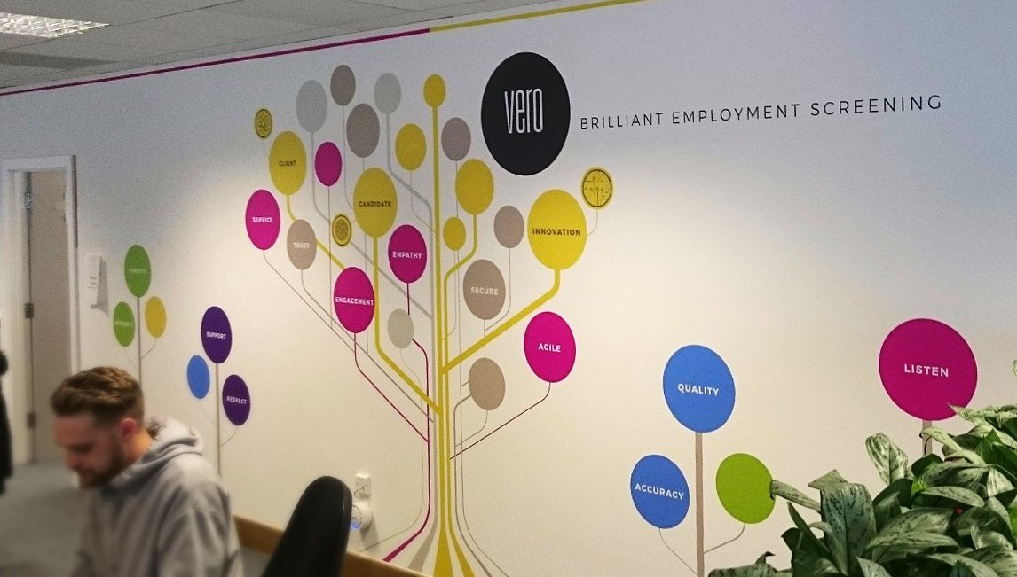
Art in the office is about more than improving the aesthetics of the workplace. A digital wallpaper containing significant areas of red, blue and green can help employees focus on detailed tasks while boosting and stimulating creative performance.

Aesthetics not anaesthetic

A utilitarian office space filled with unmotivated employees sounds like a nightmare. Yet many office spaces are designed to be precisely that. Injecting art into a bland office opens up lines of communication between employees who are keen to discuss the meaning of the new digital wallpaper, and actively reduces stress – in a Forbes’ survey, 78% of employees surveyed responded that artwork in the office helped them to relax.

Because art elicits an emotional response, it can promote social interaction and foster personal connections. That can be important as working in an increasingly digital environment makes employees less social.

Reflect your visions and values

Including art in the office environment speaks volumes about the vision and values of your business. Bare walls can give the impression that you run a no-frills operation, but add some stylish digital wallpaper and you’ll be perceived as being dynamic and savvy.

83% of employees say art is important in an office. We all take notice of our surroundings because the design elements that surround us combine to create an atmosphere and convey the right message. Give your employees input into the choice of images they see every day and you’ll create a sense of alignment between your staff and your business.

Invest in signage as art

If you’ve discounted the use of digital wallpaper or aesthetic glass manifestations for your business on reasons of cost, think again. With the proven ability to improve productivity and creativity, reduce stress and connect employees who can struggle with motivation and isolation, signage as art is a worthwhile investment.

It makes sense to create a work environment that makes your employees happy. Beautifully designed elements like digital wallpaper can create superb aesthetics that your employees will enjoy day in, day out.

Ask the experts

If you’re interested in bringing elements of art and design into your office environment, innovations like digital wallpaper are a savvy way to change things up. At The Sussex Sign Company, we can take your ideas from conceptualisation to the finished product, creating an office aesthetic that leads to productive and creative employees, so contact us now.

Signage Your London Retail Premises Can’t Afford To Ignore

How long did it take you to get the design for your ecommerce site right? And the signage for your bricks and mortar premises in London? The fact is physical signs should never be an afterthought – they’re an important part of your sales team.

Signs can help your customers navigate your store, attract them to promotions and give valuable information. You pay close attention to the way your website looks. keeping it consistent with your branding. Paying the same attention to your signs will really pay off.

Getting your signage right first time

Before you start designing your signs, take a tip from the advertising business and narrowcast your message. By defining your ideal customer, you can target the right graphics and messages to make your signs effective and eye-catching.

– Keep it simple: the most effective signs have a clear and simple message. Too much information can be confusing and your signs will be ignored. If you can’t convey your essential message in 5 seconds, then shorten it or consider using more than one sign.

– Write a headline: use an effective message hierarchy of attention-grabbing headline, concise explanatory text, and a punchy call to action.

– Always add a call to action: every sign needs a simple, effective call to action that gets the customer to do something like call or visit your website.

The four signs you can’t ignore

Exterior signs

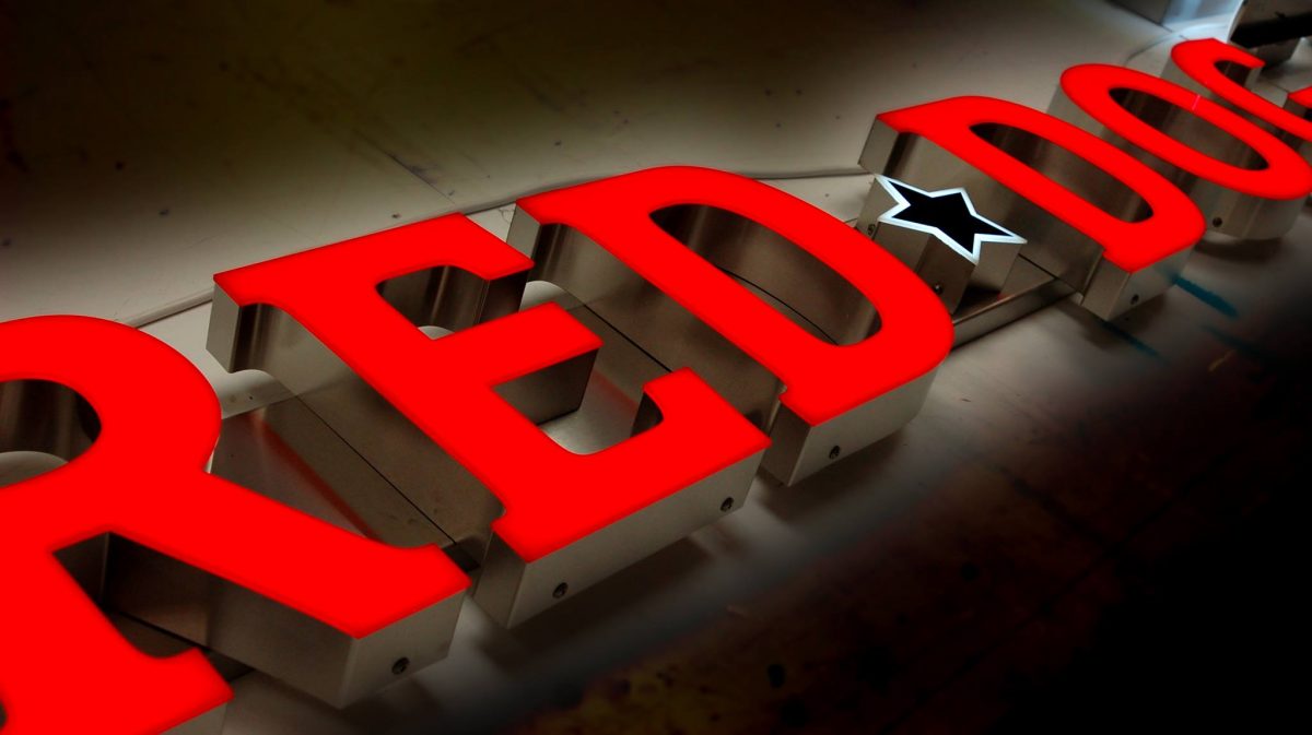
Whether you have a simple A frame outside your coffee shop or illuminated channel letters over the door, this is arguably your most important sign because it’s the one that captures your customers’ attention and gets them through the door.

These signs need to be branded effectively to convey an idea of the experience the customer can expect when they walk through the door. And they should make them want to cross the street to experience it.

Information signs

Wayfinding signs help your customers navigate easily around your premises and find what they’re looking for. Never underestimate convenience when it comes to attracting and retaining customers.

Once you start positioning your signs, you’ll become aware of any organisational snags that your customers will find frustrating, and can put them right. Keep these signs bold and colourful, but consistent with your branding.

Communicative signs

These will let your customer know about sales and promotions or they can showcase a new product. Done well, they can increase brand awareness, drive sales and even add a higher perceived value to a product.

Inclusive signs

When you’re appealing to customers, you need to be inclusive. That means complying with accessibility legislation not just in car parks and toilets but in the way you use your signs.

Signs should be both legible and readable and use pictograms and/or Braille where appropriate. Use san serif fonts and high contrast colours for the most effective signs and make sure they’re mounted at the correct height.

Effective signs for your store

If your retail premises need a new suite of exterior and interior signs, we can help. At The Sussex Sign Company, we have the experience and expertise to design, create and install signs that raise brand awareness and attract attention. Contact us today for signs that maximise your return on investment.

Signage Trends For 2020

If you thought signage was outdated, think again. The printed sign market is predicted to be worth over $47 billion by 2024, thanks to new print technologies and materials. So what are the trends that will be driving the way your London signs look through 2020 and beyond?

Bridging the technology gap

Marketers are reassessing print signs as a way to cut through and bridge the gap between digital and analogue technologies. Signs are recognised for their ability to promote brand recognition and attract customers.

The integration of technologies like Near Field Communication will bring print and digital closer together. Imagine a point of sale sign that your customer could tap with their mobile to receive a discount voucher. These multichannel experiences will be one of the key trends of 2020.

Increasing personalisation

Personalisation will impact on signs in several distinct ways. Customised and personalised print signage that delights and surprises your customers will add a sense of uniqueness to your premises through the use of digital wallpapers that are fully customised for your brand.

But personalisation extends beyond the finished product into every part of the sign making process. Customers are realising the value of working with one company who can walk them through the entire process from design to installation, ensuring the personalised results they require with an improved customer relationship that is responsive to their needs.

Creativity is king

Personalisation, creativity and quality will combine to create concept signs that deliver a complete brand experience.

There’s also a perceptible shift towards the return of minimalism in design, with less being used to do and say more for your brand. Consider Apple, the king of the minimalist brand experience. If your logo, signs and branding elements are due for an overhaul, consider letting less be more.

Continuing cost-effectiveness

A key driver of the market, printed signs will continue to provide a value added, cost-effective solution a range of businesses. The long lifespan of traditional signs, their effectiveness and lower investment make them an attractive alternative to digital signs. Properly installed and maintained, they’ll keep putting your message in the public eye with negligible ongoing costs.

Timely displays

Focused campaigns will move beyond Christmas and summer holidays to embrace a huge range of marketing opportunities. Vinyl window graphics are durable yet lightweight and can be installed in just a few minutes.

Your business will be on trend and responsive to customers’ needs and the graphics can be removed and reused for the next campaign.

Sell with the senses

2020 will see retail develop the customer experience through all five senses, allowing customers to smell, taste and touch products, as well as just see them.

Point of sale displays are the ideal way to encourage customers to interact with a new product and get excited by it. Creative signs are all part of the holistic experience directing customers to the products you want them to experience.

Signage for 2020

At The Sussex Sign Company, we can help your London based business create signs fit for the 2020s, with high quality materials and outstanding design. If you’re ready to harness the power of printed signs for your business, get in touch and our team will be happy to help.

Signage History – The Ghost Signs Of London

Have you ever half glimpsed a faded piece of signage in London? Then you’ve seen a ghost sign, one of the fascinating pieces of advertising history that can still be seen around the capital. These fading adverts, like the Hovis sign in Haringey and the Bovril sign in Brixton, have endured over the centuries and survived against all odds.

Victims of modern sign making materials and techniques, these remnants of our advertising past can be found all over the world.

How were ghost signs produced?

The signs that remain are all a testament to the skill and craftsmanship of early signwriters. Smaller signs were often produced freehand, using the height of the bricks as a guide. Larger and more elaborate signs were often produced by a technique like stencilling – the design would be traced on paper with a spiked wheel and then chalk or charcoal would be used to mark out the perforations and create the outline of the design.

Particularly skilled signwriters would often embellish their signs with decorative flourishes like illustrations.

The early days of marketing

Ghost signs are a fascinating snapshot of changing attitudes in society – like the cigarette advert that claims smoking is good for your throat! Some of the businesses associated with ghost signs didn’t outlive their own advertising, but those that did moved with the times and started to explore other ways of bringing their branding to the public’s attention.

Though the heyday of signwriting was the late 19th and early 20th centuries, the art hasn’t died out. The craftsmanship that created the ghost signs is still around, although the materials have moved on – after all, many of the signs that remain were painted using lead based paints, making signwriting something of a risky business.

What modern signage can learn from ghost signs

With the uptick in interest in these remnants from marketing’s history, modern signs can learn from their more primitive ancestors:

– Good signs have a clear message: That’s demonstrated by the enduring popularity of ghost signs that keep the branding message simple. Your signs should be equally clear and easy to grasp, so your customers understand your business at a glance.

– Good signs withstand the elements: just like the lead based paint of old, modern materials should be chosen to withstand all weather conditions including harsh sun, wind and rain.

– Good signs boost business: there’s no way of quantifying what impact the ghost signs had in their time, but our enduring fascination with them suggests they continue to engage with passersby. A good sign will attract customers and have an impact on sales, otherwise you’ll need to rethink the way you’re using your branding and brand colours.

– Good signs reflect your business personality: Ghost signs are a snapshot of businesses that were around over a hundred years ago. If you want your signs to endure, they need to reflect the personality of your business by maintaining consistency across all the signs you use.

High quality signs for your business

Your current signage may not last as long as the beloved ghost signs, but at The Sussex Sign Company, we can help ensure they have just as big an impact. To find out how to maximise your ROI, contact us today.

Signage For Sponsors: Connection And Communication

Event sponsorship, in London and across the country, connects your business to the community while communicating a positive brand message. Signage for sponsors is a savvy way to raise awareness of your brand, drive traffic towards your business and ultimately create more sales opportunities. Innovative signage puts your sponsorship front and centre for maximum impact.

By sponsoring an event, a business not only raises awareness but helps to bring an event into being, whether that’s a sporting competition or a trade show. In return, sponsors expect their branding to have an impact by being displayed where it creates most impressions, whether that’s over a podium or above the main event staging.

If you’re the organiser of a sponsored event, you need to think about the way your signs can create connection and communication while delivering awareness for your sponsors. Maximise their return on investment by creating a range of signs that keeps the sponsor’s name top of mind at every stage of the event.

Dynamic messaging

Sponsor messaging doesn’t have to be confined to the event itself. A promotional vehicle wrap including the sponsor’s branding, floor graphics or advertising at bus stops or on station platforms can all carry your sponsor’s message far and wide, connecting the journey directly to the event itself.

Creating dynamic messaging opportunities will bring your sponsor’s branding to life and can be communicated to a captive audience through wall, floor and table stickers. Think about the places where those attending the event will gather, from coffee bars to lifts, and create a suite of signs to exploit these ideal placements.

Improve aesthetics

Attention to detail can make all the difference between an also-ran and an Instagrammable event that creates a real buzz. Most stadiums and conference halls are unattractive spaces that can be improved by the addition of display stands and banners. Make sure that your sponsor’s branding features prominently on eye-catching signs that turns breezeblock walls into ideal canvases for attractive messaging.

Walkthrough your venue with an eye to framing sponsorship messages in clear and creative ways. Try wrapping a concrete pillar, framing up a poster as art or using digital wallpaper to display sponsorship branding in evocative and unusual juxtapositions that capture the attention of event attendees and create priceless impressions for your sponsors.

Get social

Maximising the reach of sponsorship branding should always include social media channels. One easy win is to use your event backdrops as customised photo backdrops with prominent sponsorship logos. This improves brand visibility for those attending the event and the media and raises the awareness of your sponsor’s brand.

Take it a step further with a branded handheld photo frame or even a selfie booth that puts your sponsor’s logo and corporate colours front and centre of every photo opportunity.

Custom signage

By using innovative placement and design, you’ll create a sponsorship package that achieves maximum exposure for your sponsors, generating a real buzz and optimising your event revenues.

At The Sussex Sign Company, we have the expertise to deliver the maximum exposure for your event and your sponsors, maximising the return on your investment while making the most of your budget. Contact us today to find out how we can help you create signage that delivers.

Production Team Member / Vehicle Wrapper

The Sussex Sign Company is delighted to announce that we have an exciting opportunity for an experienced production team member / vehicle wrapper to join our team!

Please contact our Operations Director, Linda Edwards – 01273 424900 to find out more!

Signage For Temporary Use: Why, When And What?

Wherever your business is, from London to Edinburgh, the chances are that you’ll need temporary signage. You could be thinking ahead to the winter sales or considering running your own pop-up shop or restaurant for a few weeks or months.

Whether your business is well-established or seasonal, temporary signs are lightweight, cost-effective and durable enough to promote your business in the short term.

Why you need temporary signage

Temporary signs are the savvy way to communicate time-limited information to your customers in an eye-catching way. You may want to promote a seasonal product, a temporary exhibition or event, or even a flash sale. Temporary signs are lightweight and portable, they can be installed anywhere without the need for specialised hardware and expertise and they are typically low cost to manufacture.

The lower price point means you can afford to buy enough signs to make a real marketing impact with greater reach. Opt for recyclable materials and you’ll be able to dispose of your signs after use in an environmentally sustainable way.

When do I need temporary signs?

Look around and you’ll find temporary signs everywhere, advertising sales and providing directions. You’ll even find them providing safety information on construction sites. Whenever you have an event or product to promote that has a maximum shelf life of around 3 months, temporary signage is the answer – from banners and A frames to flyers and posters.

What are the right materials for temporary signs?

There are all sorts of materials you can consider for temporary signs, all with their own advantages and disadvantages. For example, posters are a quick and easy way to get the word out to your customers, but their lack of durability means they damage easily in wet and windy conditions.

Foam board is a popular choice, thanks to its relative durability – properly looked after, foam board signs can last up to 2 years. Lightweight and easy to hang using tape, foam board can be printed to extremely high standards and the combination of this material with a knockout design can give your signs plenty of impact.

Foam board signs don’t stand up to rain and wind too well, but if the conditions are right, they can be displayed outdoors to great effect. They’re also rigid, so if you intend to keep them for the same event next year, you’ll need a place where they can store flat.

Sandwich boards may have been banned in central London, but a snappy slogan gives this type of advertising plenty of seasonal pizzazz. Who knows, you could even end up on Instagram! They may be bulky, but if you use reusable graphics, they will have the versatility you need from a temporary sign solution.

For annually occurring events, a vinyl banner is a smart solution. Extremely durable banners can last for years without looking weathered or shabby and are easy to mount using rope or even cable ties. When you’ve finished using them, just roll and store.

Seasonal signs from The Sussex Sign Company

If your business needs seasonal signs as part of your marketing mix, we can help. At The Sussex Sign Company, we ensure the best possible ROI for our clients, so contact us today.

Signage For Wayfinding In London: What It Means For Your Business

Wayfinding signage is essential in cities like London, where the ability to navigate on foot is paramount. In fact, the term wayfinding was coined in the 1960s as part of a study into what became known as ‘city legibility’.

Of course, the capital already has one of the most easily recognised and useful wayfinding documents in the world. The underground map not only makes navigating the transport system a breeze, but 45% of pedestrians also find it a valuable aid to walking the city.

The 2012 Olympics saw efforts to put a coordinated wayfinding scheme in place across the capital, with a suite of walking and digital maps and a smartphone app creating a unique and cohesive visual identity that made the city easy to navigate. So what can your business learn from this city legibility experiment?

Ask the right questions

When you’re designing a wayfinding scheme for your business, you need to understand your clients’ needs. Imagine the silent questions that they will ask when navigating your premises – your signs should be able to answer more sophisticated enquiries as well as the basics.

Putting yourself quite literally in your clients’ shoes and walking your site will give you the level of detail and understanding you need to answer those questions and determine the clearest routes.

Be consistent and accurate

The best wayfinding signage allows for seamless navigation so the client arrives where they need to be almost without realising it. The city legibility scheme achieved a consistency of look across its suite of signs and apps to guide visitors to discover the city without being nannied.

Where it sometimes fell down was on the accuracy of the signs and their measurements. City dwellers have complained of inaccurate information and even signs mounted the wrong way up. Attention to detail and accuracy is critical whether you’re providing signs for identification, direction or information. Focusing on effectively orienting your clients will make navigation as easy as possible.

Focus on creativity and innovation

One thing this legible city scheme got right, and that has made it a gold standard for similar schemes across the world, is the flawless blend of creativity and innovation. The scheme made use of apps and technology to make digital signage more appealing and effective and the monolithic column design created a series of landmarks for easy orientation.

Combining fun and functionality allows you to inject your business personality into your wayfinding signs, or lets you inject some of your online presence into your offline world. Colour coding, unique branded imagery and compelling themed graphics that integrate with your company’s USP will all attract your visitors’ attention and create a compelling and creative scheme.

High quality wayfinding signage

Of course, navigating the complexity of a big city presents challenges that wayfinding for your office complex or retail premises are unlikely to face. But that doesn’t mean you can’t take the key findings of a legible city scheme and incorporate them into your own seamless scheme.

If you’re interested in finding out more about creating wayfinding signs that reflect and reinforce your brand image, while getting your clients and customers where they need to go, contact The Sussex Sign Company today.

Signage Fails And How To Avoid Them

Creating signage for your London business can seem like a nightmare and it’s easy to get it wrong. Nailing the design and readability, choosing the right materials and displaying your logo correctly are all time-consuming. It can seem easier to spend time and money on your website and forget your sign altogether, and that’s the biggest signage fail of them all – a stellar sign can do wonders for your brand appeal and integrity.

These hints and tips should help you avoid the most common fails and help you create killer signs that tie all your marketing channels together in your bricks and mortar premises.

Common design fails

There are three obvious design faults that can spoil the impact of your design: lack of contrast, the wrong choice of font and poor character spacing.

Your signage should incorporate your brand colours, but don’t be afraid to use a high contrast background, against which your logo and lettering can really pop.

When it comes to choosing fonts, classic san serif styles are always easier to read than gothic or handwriting style fonts and legibility is the name of the game. While your font can reflect the personality of your business, when it comes to Comic Sans, just don’t!

Spacing is all about creating an aesthetically pleasing look that is easy on the eye. A couple of useful tips are to measure and measure again, to make sure your letters don’t end up climbing up the side of your sign. And always use a template to ensure proper spacing for letters that can butt up to each other and those that can’t.

Size matters

It’s not just about readability, but do you know what your logo looks like when inflated to the right size for your new sign? You only have to Google ‘sign fails’ to identify seemingly innocent logos and images that went horribly wrong.

But size is a serious issue when it comes to creating signs that have maximum impact while retaining readability and legibility. From a viewing distance of 30 metres/100 feet, each letter needs to be 10cm/4 inches tall with a balanced negative space all around – you’ll need to factor this in when creating fascias and it may impact the installation location.

Material world

Do you really need premium materials for the sign you have in mind? Or will a minor upgrade ensure that your signs has a longer lifespan? Always choose the right quality of materials bearing in mind installation and location – what works for one business may not work for yours, and materials that perform well in one location might let you down if your installation is particularly exposed.

Avoiding signage fails with The Sussex Sign Company

If you’re fully invested in the success of your business, you won’t want to forget about your offline branding. Getting it right can have a huge impact on the way your business is perceived, and a well designed and executed sign can speak volumes about your brand.

At The Sussex Sign Company, we’ll help you avoid the obvious signage fails to create signs that promote brand recognition and maximise your return on investment. Contact us today to start maximising your offline business assets.

Signage Size Matters So Get The Right Size For The Job

When it comes to creating eye-catching signs for your London business, size really does matter. It’s critical that you get the size right when it comes to signage – too large and you can ruin the aesthetic of your premises, too small and you’ll never get noticed and your potential customers will never know who you are.

The optimum size for your signs is one that catches the attention of passersby and is easily read from a distance. The easiest way to take a rough gauge is to step away from your premises and view them as a customer would. Proportionality is key when you’re sizing your signs – try not to let them dominate or be so large they block the natural light.

Measure twice, design once

When you’re taking measurements for your signs, be careful to factor in any windows and doors. Your signs should never block the light or stop customers being able to enter your premises. Measure and remeasure to make sure your design will scale accurately without causing any kind of obstruction.

Location, location, location

Another critical element in scaling your sign to the right size is its eventual location. This is the best way to begin to understand the optimal size for your new signs.

Just looking at the sign’s intended location should give you an idea of the right scale for your sign. If you’re competing with other businesses on a busy high street, take a look at what seems to work best in terms of size and design.

If your sign is intended to be displayed at eye level, you’ll need to to make it readable without your customers having to take a step back. If it’s being displayed at an elevated location, then it should be clear enough and big enough to be seen from street level.

Link size and design

These are the two factors that are most closely linked when it comes to creating proportional signs. You’ll start with a finite space where the sign is designed to be installed, but don’t be tempted to fill it all with information. Instead, prioritise your company name and determine how legible that will be from a distance.

Now start to work on the rest of the design, adding your elements individually to create the most harmonious aesthetic focused around the key text. This should help you to visualise the size of text and the size of sign that will work best in the given space.

Don’t forget your budget

Another important consideration will be the size of your budget. After all, the bigger the sign, the bigger the budget required, so you may want to scale back your original ideas if you’re in danger of going over your maximum budget.

Creating professional signage in East Sussex

When it comes to creating fantastic signs, it’s all about perception. This is the first impression a potential customer has of your building, so you need to get it right. The easiest way to do that is to work with us at The Sussex Sign Company – we’ll help you maximise your ROI with the perfect sign, so contact us today.